TL;DR
- Every CTA has three parts: a specific verb, the outcome the user gets, and a clickable element such as a button, link, tel: number or form.
- Meta ads force you to pick a CTA button label from a fixed list; Google responsive search ads have no button, so the invitation goes in a 30-character headline or 90-character description.
- GA4 enhanced measurement records outbound clicks and form_start/form_submit, but clicks on buttons that stay on your own site need a Tag Manager trigger and a custom event such as cta_click.
- Judge a CTA by click rate against people who actually saw it (Element Visibility trigger), then follow the click through to submitted forms, started chats or orders.
A CTA (call to action) is the text or button that tells a reader exactly what to do next, such as "Request a quote", "Buy now" or "Add us on LINE to ask". Its job is to turn interest on a web page, email or ad into an action you can measure. Without one, a reader who is already interested has to work out alone how to contact you or buy, and a fair share of them close the tab instead.
This article explains what a call to action is in mechanical terms, what makes a good one, the main types, where to place them on a website or landing page, what wording works in Thai, when to use a button versus a text link, how CTAs differ between Google and Meta ads, and how to measure CTA clicks in GA4.
What a CTA is and how it works
In practice every CTA has three parts. The first is a verb that names the action: "download", "book", "consult". The second is what the user gets: "the price guide" or "a Saturday appointment". The third is the thing they can actually click or tap, which might be a button, a link, a tappable phone number or a form. When all three are clear, users know what will happen before they press.
CTAs are not only for selling. Some are micro conversions, small steps that move a user closer to a decision, like "See our work" or "Subscribe to the newsletter". Others are macro conversions, the main business goal, like "Pay now" or "Send quote request". A good page usually has one primary goal and uses secondary CTAs to hold on to people who are not ready yet.
It also helps to accept that a CTA only works once the content before it has done its job. No button can save a page where the reader still does not understand what the product is, roughly what it costs or why they should trust you. Fixing a CTA often means fixing the copy around it, not just the button color.
What a good CTA is made of
A specific verb
Words like "Submit" or "OK" name an action but not an outcome. Compare "Submit" with "Send my quote request". The second answers the question "what do I get?" before the click. The higher the cost of the action, such as entering personal details or paying, the clearer the outcome should be.
A reason or a reassurance
A short line under the button does a lot of work: "No charge", "Reply within one business day", "Cancel any time". These lines must be true to the business's actual policy. Promising something you cannot deliver costs trust the moment the customer gets in touch.
Easy to see and easy to tap
The primary button should contrast with the background and look different from secondary buttons. Apple's design guidelines recommend a tap target of at least about 44 x 44 points, and Google's Material Design recommends about 48 x 48 dp. On mobile this matters, because small buttons cause mis-taps on neighbouring links. Button text also needs to be readable: WCAG sets a minimum contrast ratio of 4.5:1 for normal text.
One destination per button
A single button should not lead to different places. If "Contact us" sometimes opens a form and sometimes opens LINE, users get confused and your reporting mixes two behaviours into one number.
Common types of CTA
Sorting CTAs by type makes it easier to choose wording and placement. The main types are:
- Primary CTA: the action the page exists for, such as "Book an appointment" on a clinic service page.
- Secondary CTA: for people not ready yet, such as "See package prices" or "Read reviews". It should look clearly lighter than the primary button.
- Lead-capture CTA: trades contact details for something useful, such as a guide, a price sheet or an initial assessment.
- Contact-now CTA: a call button, an add-on-LINE button or a chat launcher. It suits services where customers want to ask before deciding.
- In-content CTA: a link at the end of an article that leads to further reading or a related service page.
| CTA type | Example wording | Best suited to |
|---|---|---|
| Primary sales CTA | Buy now, Pay now | Product and cart pages where the user has decided |
| Lead-capture CTA | Request a quote, Download the guide | B2B services or high-priced products that need a conversation |
| Contact-now CTA | Ask on LINE, Call now | Mobile users and businesses that answer chat quickly |
| Secondary CTA | See our work, Compare packages | Readers who are still researching |
Button or text link: what is the difference?
A button suits the main action you want seen immediately, because its shape and color say "press here" in a fraction of a second. A text link suits further reading or actions that need context, such as a link mid-paragraph to a related service. Links feel less pushy, so they do not interrupt reading.
The simple rule: if the action is the page's goal, use a button. If it is an optional extra, use a link. And never make the link text "click here". Screen reader users hear only those words with no clue where the link goes, and Google uses anchor text as one signal for understanding the destination page.
Technically, a "button" that goes to another page should be a link styled as a button, while something that submits a form or opens a dialog should be a real button element. Using the right element keeps keyboard and screen reader behaviour correct and makes tracking easier to set up.
Where to place CTAs on a web page and landing page
The right position depends on what readers need to know before they are ready. For a brand people already know, or a low-priced product, a CTA at the very top works. For a service that needs explaining, readers may need to see price, process and answers to doubts first, so a CTA at the end of those sections tends to work better.
A common pattern on one page:
- Top (hero): one primary button, possibly one secondary button.
- After the section that answers the biggest worry, such as price, process or reviews: repeat the primary CTA with the same wording.
- End of page: close with the primary CTA again for people who read to the bottom.
- On mobile, a sticky CTA bar at the bottom of the screen keeps the action within reach, as long as it does not cover content or pop-up close buttons.
On an ad landing page, the rule that holds almost everywhere is one page, one goal: cut menu links that lead away and point every CTA at the same action. If you want this built into the page structure from the start, see landing page design.
Thai CTA wording and how to write copy people want to click
Good Thai CTA wording is usually short, verb-first and names what the user gets. Examples that fit many businesses (shown here in English translation):
- Services: "Request a quote", "Book a free 30-minute consultation" (only if you actually offer it)
- E-commerce: "Add to cart", "Order now, free shipping over the minimum" (per the shop's real terms)
- Clinics and service shops: "Book a slot", "Check today's availability"
- Content: "Download the guide", "Get the checklist by email"
- Chat: "Ask for prices on LINE", "Message our team"
Thai has its own pitfalls. First, Thai does not put spaces between words, so a narrow button can break a line mid-word. Test on a real phone screen and pick wording short enough for one line. Second, the tone has to match the brand. Polite particles like "ka" or "krub" fit a friendly brand, but usually do not belong on the button itself. Third, mixing in English, such as "Add to cart" on a Thai site, makes some users translate in their heads. If your audience is more comfortable with Thai words, use Thai.
Good CTA copy starts with understanding what readers are worried about, which is the same work as planning the whole page. That is why a content marketing team usually writes headings, body copy and CTAs together.
How CTAs differ between Google and Meta ads
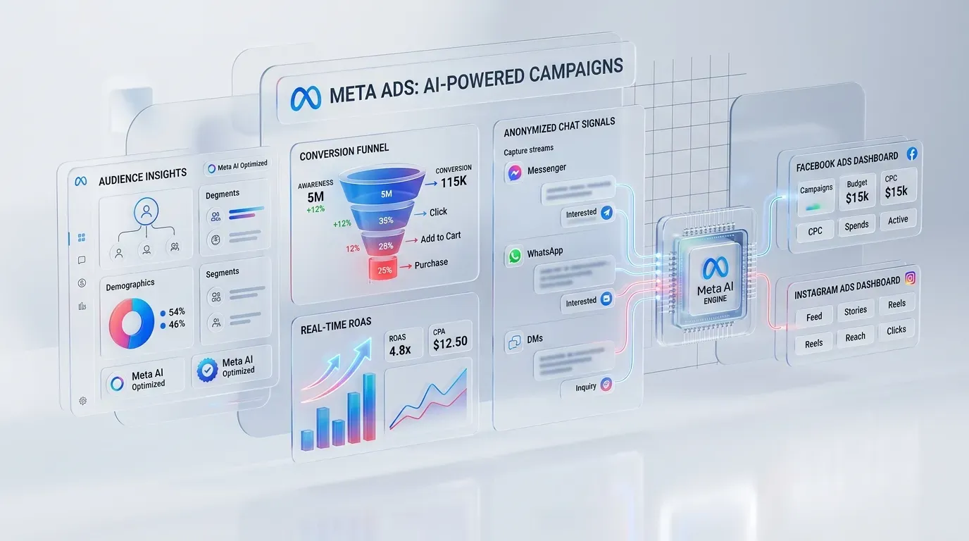
On Meta ads (Facebook and Instagram), the CTA button is picked from a list the platform defines, such as Learn more, Shop now, Sign up, Contact us or Send message. The button label is shown in the user's language and advertisers cannot type their own. Any specific invitation has to go in the primary text or headline instead, and the button should match what happens after the click: if the destination is a chat, use Send message, not Shop now.
On Google Search, responsive search ads have no separate CTA button. The invitation has to be written into a headline (up to 30 characters) or a description (up to 90 characters). Google Ads editorial policy does not accept calls to action so generic they could apply to any ad, such as "click here", so be specific: "Get a quote today". Assets such as sitelinks and call buttons act as extra CTAs pointing to different pages. Google Ads lead forms, like Meta, offer a fixed list of button labels to choose from.
What both share is that the ad CTA must match the landing page. If the ad says "See prices" and the page shows no prices, users leave at once, which hurts both conversion rate and the landing page experience that Google uses to judge ad quality. To line up ads and destination pages, see Google Ads management.
In email, CTAs work much like on the web but with extra limits. Many email clients block images by default, so an image-only button may not show. Build buttons in HTML with live text, and give each email one primary CTA. For planning email sequences, see email marketing.
How to track CTA clicks in GA4
Measuring CTAs in GA4 starts with knowing what is collected automatically and what you must set up. GA4's enhanced measurement records clicks on links leaving your domain (an event named click) and form starts and submits (form_start, form_submit). Clicks on buttons that stay on your own site are not recorded as separate events, so they need extra setup. Automatic form tracking can also miss some form types, so check in DebugView before you trust the numbers.
The usual steps through Google Tag Manager are:
- Give each CTA an ID or data attribute, for example marking its position as hero or footer.
- Create a Click trigger that fires only on those buttons.
- Send a single event, such as cta_click, with parameters like cta_text and cta_location.
- Register those parameters as custom dimensions in GA4 so you can split reports by them.
- If the click is a business goal, mark it as a key event (GA4's current name for what used to be called a conversion).
The number to watch is CTA click rate against the people who actually saw it, not against all page visitors. Hypothetical example: a page gets 2,000 views, only 800 of them scroll far enough to see the end-of-page CTA, and it gets 40 clicks. The click rate against people who saw it is 5%, while against all views it is 2%. The first figure tells you how the button performs. The second tells you whether its position is right. You can count "seen" with an Element Visibility trigger in Tag Manager.
Finally, a click is not a sale. Follow the click through to the outcome: a form that was actually submitted, a chat that actually started, an order. A CTA with many clicks but few completed forms may be promising something the next page does not deliver.
A/B testing CTAs
Google Optimize was shut down in September 2023, so website A/B tests now need another vendor's tool or the site's own system. The fundamentals have not changed: change one variable at a time, such as button wording or position, not both at once, and wait for enough data before drawing a conclusion. A low-traffic site may need several weeks, or should test bigger levers, like the offer, rather than button color.
Mistakes that stop CTAs working
- Several primary CTAs competing, so users do not know which to press.
- Generic words like "Submit" or "Click here" that do not state an outcome.
- A primary button in the same color as other elements, so it does not look pressable.
- A form behind the button that asks for more than it needs, so people click but do not submit.
- LINE or call buttons that fail on some devices because nobody tested them on a real phone.
- Changing a CTA without before-and-after measurement, so nobody knows if it got better or worse.
CTAs in the Thai market: what differs from overseas guides
Most CTA guides are written for markets where forms and email are the main channel. In Thailand many customers are used to messaging before they buy, so an "Add on LINE" or "Chat with us" button is often as important as the form. The catch is measurement: once a user leaves the site for the LINE app, GA4 sees only the click, not whether a chat or a purchase happened. Businesses that lean on this channel should have a way to match chat leads to their source, such as different opening messages per page or tagging inside the chat system.
Call buttons matter for local businesses and urgent services too. A tel: link dials straight away on mobile but may do nothing on a desktop, so show the number as text as well. And if a CTA leads to a form that collects personal data, tell people what the data will be used for, in line with the business's privacy practices. For legal specifics, consult a qualified adviser directly.
Frequently asked questions about CTAs
What does CTA stand for?
CTA stands for call to action, meaning an invitation to act. It covers buttons, links and text that tell the reader what to do next.
How many CTAs should one page have?
One page should have a single primary goal, but the button for that goal can repeat in several places on a long page, such as the top, the middle and the end. Secondary CTAs should be few and clearly lighter.
What is the best color for a CTA button?
No single color is best for every site. What matters is contrast with the background and surrounding elements. The primary button should use a color not used elsewhere on the page, with text contrast high enough to read easily.
How do I know if a CTA is working?
Look at click rate against people who actually saw the button, then check whether those clicks turned into outcomes such as submitted forms or orders, using events and key events in GA4 as described above.
Summary
A CTA is the point where a reader's interest becomes an action. Most of the work is not in the button itself but in choosing one clear goal, writing words that state the outcome, placing it after the point where readers are ready, and measuring all the way to the result. If you want your pages, ads and emails to use consistent CTAs across the whole journey, the Relevant Audience team can help from page structure through to tracking setup. Start with landing page design built around a single goal from the start.