
TL;DR
- A design brief tells the designer the objective, the audience, the deliverables with exact specs, the deadline and who gives final approval; it does not dictate how the work should look.
- Seven elements belong in every brief: brand background, objective and measure, audience, scope and deliverables, key message, visual direction with things to avoid, and timeline, budget and approver.
- Abstract words like premium or eye-catching cause revisions; replace them with checkable statements such as a headline of 8 words or fewer or a logo at least one fifth of the image width.
- Send feedback as one consolidated set through one person, and have the final approver agree the brief before work starts.
- Thai-language work needs the brief to name a licensed Thai font, allow line spacing for stacked vowels and tone marks, and supply both language versions of bilingual copy together.
A design brief is a short document that tells a designer what a piece of work is for, who will see it, what must be delivered, in which sizes, by what date, and what test decides whether the work passes. If the brief answers these questions completely and in concrete terms, the designer starts from the same understanding you have, and revision rounds drop because disagreements get settled on paper rather than after the design is done. This article explains what a design brief is, the 7 elements it should contain, how to brief graphic work so it needs fewer revisions, and ends with a design brief example you can copy and adapt.
What a design brief is and why graphic work needs one
A design brief is the starting document for one design piece or one set of pieces. It is written by the client side (or the marketing team that owns the work) and sent to the designer, whether that designer is in-house, a freelancer or an agency. The document does not say what the design should look like. It says what the problem is and what a good piece of work has to solve. The designer's job is to find the visual answer to that problem.
A graphic design brief matters for three tangible reasons. First, it turns requirements that live in several people's heads into one piece of text that everyone reads the same way. Second, it is the review standard. When the first draft arrives, you can ask whether the work meets the objective in the brief instead of judging it on personal taste. Third, it is the record of scope. If someone asks for an extra piece or a change of direction halfway through, everyone can open the brief and see whether that request sits inside the original scope or is new work.
What usually happens without a brief is that work gets ordered over chat in a short message, such as "Need a promo post for next month, bright tone, urgent." The designer has to guess what the promotion is, how big the discount is, which channel it runs on, what size it needs, and which colours "bright" means. The work goes out, the answer comes back as "not quite," and the revisions go round and round. Every round costs both sides time, and if the work is outsourced, many contracts cap the number of revision rounds, with extra rounds often charged on top.
How a design brief differs from a creative brief and a mood board
A creative brief usually covers a whole campaign: the central idea, the messaging and several channels. A design brief focuses on the design work itself, such as a logo, a set of posts, banners, packaging or a web page, so it has to go deeper into technical detail like file sizes, colour systems and the files to be handed over. A mood board is an overview of mood and visual direction, usually attached to the brief or built with the designer after the brief is agreed. A mood board answers "how should it feel," but it does not say who the audience is, what has to be delivered or how results will be judged. The two are used together, not as substitutes for each other.
What should a design brief include: the 7 essential elements
A good brief does not have to be long. A small set of social posts might need a single page, while a brand identity project might run to several pages. At any size, it should answer these 7 headings in full. If a heading genuinely does not apply to the job, write "none" rather than leaving it blank, because a blank space forces the designer to guess.
1. Brand background and why the work exists
Write briefly who the brand is, what it sells, where it sits in the market, and why this piece of work is happening now, for example a new branch, a new product, a shift in target customers, or existing material that is not working. If there is earlier work that did not perform, attach it and say where it fell short. This stops the designer from proposing a route that has already been tried and failed.
2. Objective and how success will be measured
State what the work has to make happen: get people to register, get people to remember a new brand name, give sales staff something to explain the product with in store, or make the packaging stand out on the shelf. There should be one main objective. If there are several, rank them, because one design piece usually does one or two things well. If the result can be measured, write the measure down too, such as a banner's click-through rate or the number of people who scan the QR code on a poster. The designer is not directly responsible for that number, but knowing the goal lets them set priorities inside the image correctly.
3. Target audience
Say who will see the work, in what situation, and what they already know about the brand. "Women aged 25-40" is still too broad. Add whether they see it on a phone while scrolling a feed or on a sign in a mall while walking past, how many seconds they have to look, whether they have bought from the brand before, and whether they mainly read Thai or English. These details directly decide the type size, the amount of text and how prominent the logo is.
4. Scope and deliverables
This is the section that causes the most repeat revisions when it is incomplete. List how many pieces you need, where each one will be used, what size it is, and what file format the final file must be. For example: an Instagram portrait feed post at 1080 x 1350 pixels, a story at 1080 x 1920 pixels, or an A3 poster for print in CMYK with bleed as specified by the printer. For a logo, list the files you need, such as the original vector file, a transparent PNG and a single-colour version. Also write clearly what is not in scope, for example no photography, or no ad copywriting.
5. Key message and the content that must appear
Send the real copy, not placeholder text, because the length of a headline can change the layout of a whole page. A Thai headline that runs longer than the designer allowed for may force the type down to a size that is hard to read. Mark which message matters most, which is secondary, and which mandatory text cannot be cut, such as promotion terms, a licence number or a legal warning required for certain product categories. If the copy is not ready yet, give an approximate word count and the date the real copy will arrive.
6. Visual direction, mandatories and things to avoid
Attach the brand guidelines (if any), the logo files, colour codes and required fonts. Then attach reference images with a reason for what you like in each one, for example "like the spacing around the type, not the colours." Finally, list what must not be done, such as no colours used by competitors in the same category, no stock photos showing recognisable faces, or no logo placed on a patterned background. The "do not" list is the part people most often forget, yet it is the fastest way to rule out wrong directions.
7. Timeline, budget and approver
Give the date for the first draft, the date for feedback and the go-live date, and leave time for the approver to review. State the number of revision rounds agreed, and give a budget range or at least the level of work you expect, because work that needs custom illustration takes far longer than a layout built from existing images. The last item, and a very important one, is the name of the person with final sign-off. Without it, work that has passed the team lead can be overturned completely by an executive on the last day.
How to brief graphic work for fewer revisions, using concrete language
A brief that covers all 7 headings can still lead to many revision rounds if the language is abstract. Words like "modern," "premium," "expensive-looking" and "eye-catching" mean different things in different people's heads. A designer can read them several ways, and none of those readings may match the picture in your head. The principle of a concrete brief is to turn adjectives into things that can be checked. These methods work in practice.
Use numbers instead of adjectives
Instead of "make the logo big," write "logo width at least one fifth of the image width." Instead of "not much text," write "headline no more than 8 words, plus one line of secondary text." The numbers do not have to be perfect, and the designer can adjust them with a reason, but they give both sides a starting point that can be measured. When the draft arrives, you discuss numbers, not feelings.
Attach reference images with reasons
Reference images sent without explanation are a common source of misunderstanding, because one image contains many elements. The designer may borrow the colours when you only liked the layout. Under every reference image, write what you like and what you do not, such as "Image 2: like the generous white space, do not want the grey tones." Two lines per image is enough, and only a few images are really useful. A large pile of references pointing in conflicting directions confuses the designer more than it helps.
State what must not be done
Saying what you do not want removes options faster than saying what you want. If customers have said the brand looks like a competitor, write which colours or shapes are off limits. If the executive dislikes cartoon imagery, write it down from the start. This kind of information usually goes unmentioned until people see the work, and then it becomes a revision round that could have been avoided.
Separate "must have" from "nice to have"
Make a two-column list. The first column holds the requirements without which the work cannot be used, such as the logo, the promotion terms or the file size. The second holds things you would like but that can flex, such as using the product shot together with a model. Separating them tells the designer where there is room to experiment and where not to touch.
Consolidate feedback into one set
When a draft arrives, collect comments from everyone involved first, then send them back as one document through one person. If comments conflict, settle it inside your team before sending. Feedback that trickles in from several people over several channels makes the designer revise to the first comment and then reverse it when the second one lands. Each feedback point should name the problem and refer back to the brief, for example "The headline is unreadable on mobile, and the brief says most viewers see it on mobile," which is better than "make it bigger," because the designer may have better ways to fix the problem than simply enlarging the type.
Hold a short brief call before work starts
After sending the brief, set up a short call so the designer can ask questions. The questions a designer asks are signals of what the brief is missing. Add the answers straight back into the document so the brief stays the single source of information rather than being scattered across chats and emails.
The table below shows examples of turning abstract instructions into concrete statements a designer can check.
| Abstract instruction | Written concretely | Effect on the work |
|---|---|---|
| "Make the logo big" | Logo width at least one fifth of the image width, placed top right | The designer places it correctly from the first draft, and it can be checked by measuring |
| "Premium tone" | No more than two brand colours, lots of white space, references 1 and 3 liked for their thin type | Less interpretation, with options left inside an agreed frame |
| "Not much text" | Headline of 8 words or fewer, one line of secondary text, promotion terms can be small but must be legible | The layout does not need rebuilding when the real copy arrives |
| "Nothing like the usual" | No red background and no stock photos of smiling people giving a thumbs-up, which were used in the last campaign | Wrong routes are ruled out before work starts |
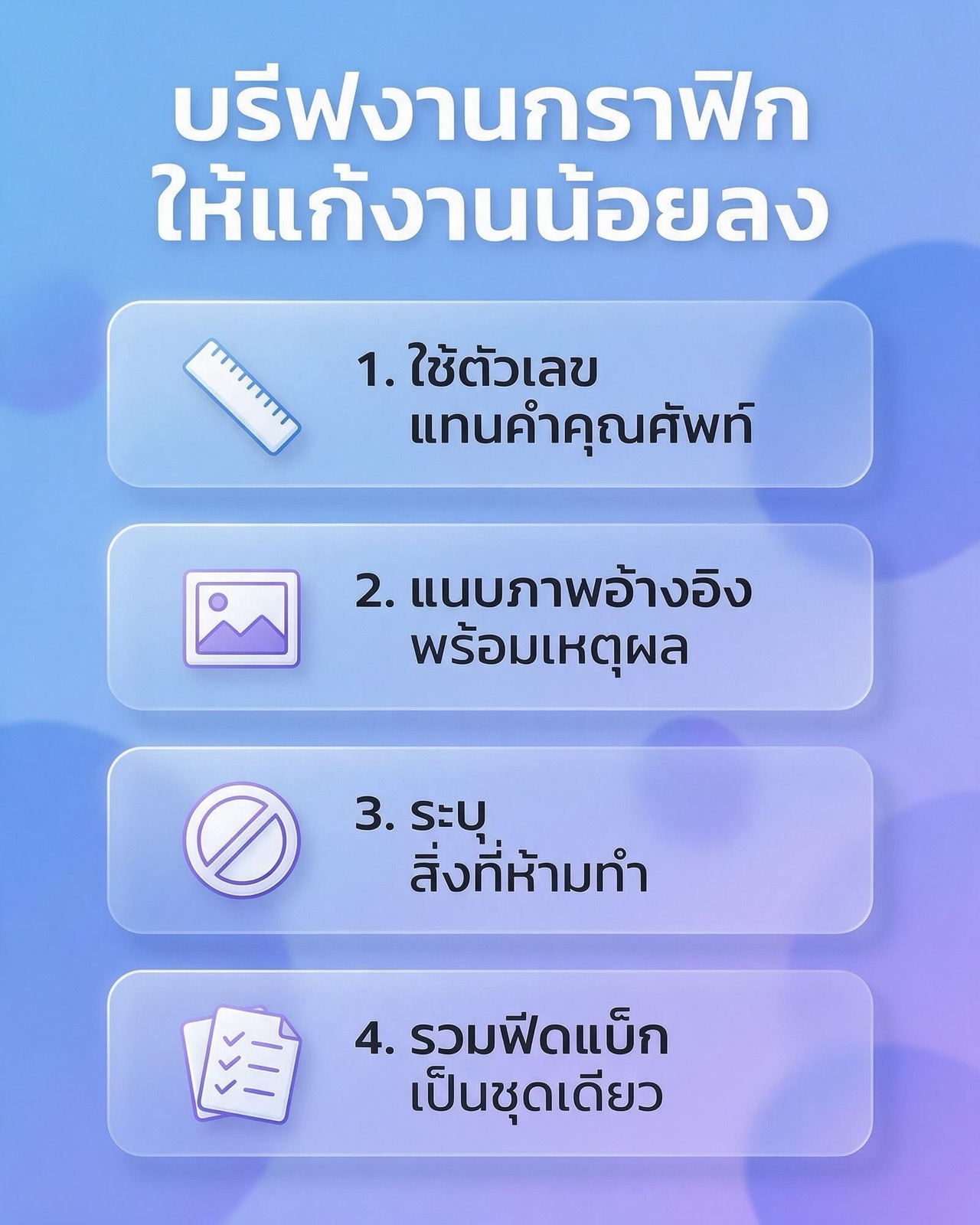
Design brief example: a template you can adapt
The example below is fictional and for illustration only. The shop name, numbers and dates are all invented to show how each heading can be written, and they are not data from a real business. Copy the structure and replace it with your own information.
Design brief example (fictional): new-branch launch posts for the "Baan Kua" coffee shop
- Background: Baan Kua is a fictional coffee shop with one branch in a residential area, selling its own roasted coffee and baked goods. It is opening a second branch near an office building. The shop's past posts used phone photos with inconsistent colour.
- Objective: Let people working in nearby buildings know when and where the new branch opens, and get them to use the opening coupon. The measure is the number of coupons redeemed in the first two weeks.
- Target audience: Office workers who see the posts on their phones in the morning and at lunch, read mainly Thai, and mostly do not know the shop yet.
- Deliverables: 3 portrait feed posts at 1080 x 1350 pixels and 2 stories at 1080 x 1920 pixels, delivered as JPG plus editable source files. Photography is not included. The shop will supply 10 product photos.
- Key message: "Baan Kua second branch, now open." Secondary text is the opening date and a landmark for the location. Mandatory text is the coupon terms: one coupon per cup, valid until the stated date.
- Visual direction: Dark brown and cream to match the existing logo, fonts as per the attached files, 3 reference images with a reason under each. No stock photos showing faces, and no logo placed over a busy background.
- Must have / nice to have: Must have the logo, opening date and coupon terms. Nice to have a simple map graphic in the stories, which can be dropped if space is tight.
- Timeline and approver: First draft within 5 working days of receiving the brief, consolidated feedback within 2 working days, 2 revision rounds, and the shop owner as the only final approver.
Notice that this example never uses the words "beautiful," "modern" or "stand out." Every line can be checked against the work, and the designer still has full freedom over the layout, the typography and how the story is told visually.
For larger jobs, such as logo design or a full brand identity system, the brief needs strategic information as well, such as the brand's position against the market, the brand personality, and every place the logo will be used, from a small app icon to a shopfront sign. For a website, the brief should list the main pages to be designed, how they must work on mobile, and the platform the site is built on, so the design can actually be built.
Mistakes that make a brief fail
- The brief designs the piece for the designer: writing "logo top left, product image in the centre, use orange" for every element turns the work into instruction-following and loses the chance of a better answer. State the problem and the constraints, and leave the solution to the designer.
- Several objectives with equal weight: a single post that has to build awareness, sell, tell the brand story and recruit staff at the same time usually achieves none of them.
- Copy sent after the layout is done: real copy that is longer than the placeholder forces the layout to be rebuilt.
- No file specs: work designed as a square image that then has to run as a portrait story needs almost a full re-layout, not just resizing.
- The real approver never saw the brief: an executive who first sees the work at the end often has comments that belonged in the brief from the start. Have the approver read and agree the brief before work begins.
- Changing the brief midway without updating it: if the objective or scope changes, update the brief and say clearly that it is a new brief, not a normal revision round.
Extra considerations for design work in the Thai market
Graphic work that uses Thai has details that belong in the brief from the start. First, fonts. Many English fonts that brands use have no Thai glyphs, so state which Thai font will be paired with them and check its commercial licence, because some free fonts allow personal use only. Second, line spacing. Thai script stacks upper vowels, lower vowels and tone marks, so if line spacing is squeezed to match English settings, vowels and tone marks can collide or get clipped. Third, bilingual work. The same message in Thai and English is not the same length, so if the work has to carry both languages, send both versions of the copy together and say which language is primary.
Fourth, channels. Many Thai businesses run a LINE Official Account alongside Facebook and Instagram, and each channel has its own image sizes and safe areas. Check the latest specs on the platform's help pages before writing them into the brief, because platforms change sizes from time to time. Fifth, legally required text for certain product categories, such as dietary supplements or alcoholic drinks, which have specific advertising rules. Have whoever handles legal matters for the brand confirm this text before the brief goes out, rather than leaving the decision to the designer.
Measuring whether your briefs are improving
If you want to know whether the new way of writing briefs actually helps, record three things for every job: the number of revision rounds before approval, the cause of each round, and the number of days from receiving the brief to approval. After several jobs, look at which heading of the brief most rounds trace back to. If most come from copy arriving late, fix the copy process. If they come from executives who did not read the brief, add a brief sign-off step. The limit to accept is that a good brief cuts revisions caused by misunderstanding, but it does not guarantee every draft passes first time. Design still involves trying and adjusting, which is a normal part of the work.
A well-written brief keeps being useful afterwards, both as a template for the next job and as input for the team handling content marketing, which needs the same key message and audience.
Design brief FAQ
What is a design brief, in short?
A design brief is a document the client writes to tell the designer what the design piece is meant to achieve, who it is for, which deliverables are needed in which specs, and when it must be finished. It is used both as the starting point for the work and as the standard for reviewing it at the end.
How long should a design brief be?
A design brief should be as long as it needs to be to answer all 7 elements. A small set of posts may fit on one page, while a brand identity or website project may run to several pages. What matters more than length is that every line can be checked, rather than being a loose adjective.
Who should write a graphic design brief?
The person who owns the outcome of the work should write the brief, usually the marketing team or the business owner. The designer or agency can ask questions and fill in the technical parts, but the objective, the audience and the approver have to come from the client side.
Can I write a brief if I do not know what I want the design to look like yet?
Yes, because a brief does not have to describe how the work looks. Stating the problem, the audience, the mandatories and the things to avoid is enough. The visual direction can then be developed with the designer through a mood board once the brief is agreed.
Should the number of revision rounds be set in the brief?
Yes, because the number of revision rounds affects the time and cost of the work, and it pushes both sides to consolidate feedback into one set instead of sending comments one at a time. If you are outsourcing, check that the number of rounds in the brief matches what is written in the contract or quotation.
Start with a good brief before the design starts
A good design brief does not take long to write, but it saves revision time across the whole project. If you are planning graphic, logo or brand identity work and want a team that questions the brief from the start, see Relevant Audience's graphic design services, or if your project is a website, see Relevant Audience's web design services page and send your brief to talk it through.