
TL;DR
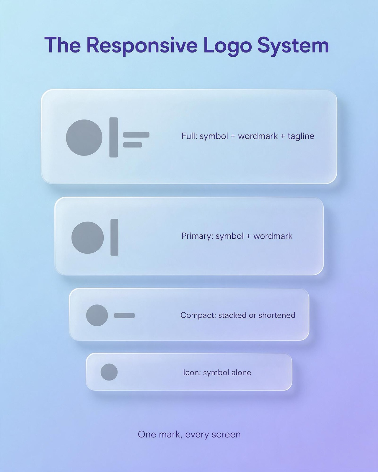
- A responsive logo system usually has four levels: Full (symbol, wordmark, tagline), Primary (symbol and wordmark), Compact (stacked or shortened) and Icon (symbol alone).
- Smaller levels must be redrawn with thicker strokes, wider gaps and less detail; cropping the symbol out of the main file produces an Icon that blurs at favicon size.
- There is no universal minimum logo size: set each level's minimum by testing on real screens and in print, then record it in the brand guidelines.
- A complete hand-off includes SVG for web, transparent PNG, vector PDF/EPS/AI for print, colour codes, plus favicon, 180 px Apple touch icon and 192/512 px manifest icons.
- Thai vowel and tone marks above and below the line are the first details lost at small sizes, so decide which levels carry the Thai wordmark and record it in the guidelines.
A responsive logo is a set of related versions of one logo, each drawn for a different amount of space, so the brand stays recognisable from a billboard down to a 16-pixel browser tab. Instead of shrinking a single file until it breaks, you design a family of three or four lockups (usually called Full, Primary, Compact and Icon) and swap between them as the available space gets smaller.
This guide covers what a responsive logo actually is, why one fixed mark no longer works for most brands, how the four-level system is structured, how to design and test each level, which files a designer should hand over at the end, and how a few well-known brands use the same idea. It does not repeat the basics of logo types and design principles. It starts from the point where you already have a logo and need it to work on every screen and surface your brand appears on.
What is a responsive logo?
The term borrows from responsive web design, where a page rearranges its layout depending on the width of the screen. A responsive logo applies the same thinking to the brand mark. As the space available to the logo shrinks, detail is removed in a planned order: first the tagline, then the long horizontal arrangement, then the wordmark, until only the most distinctive element remains.
Three points separate a responsive logo from a logo that has simply been resized:
- Each version is drawn, not scaled. The Compact and Icon versions are redrawn with thicker strokes, wider gaps and fewer details, because fine lines that look elegant at 300 pixels merge into a blur at 32.
- The versions share a visible family resemblance. Same colours, same symbol, same letterforms where letters remain. Someone who sees the favicon and then the website header should read them as the same brand without thinking about it.
- There are written rules for switching. The system says which version to use at which size and in which context, so a developer, a printer or a social media coordinator does not have to guess.
A responsive logo is therefore less a single design and more a small, documented system. That is why it usually sits inside a broader brand identity project rather than being treated as one more file in the logo folder.
Responsive logos are essential: why one mark must scale across screens
For most of the twentieth century a company logo had a handful of homes: a sign, a letterhead, a business card, packaging, perhaps a vehicle. Those surfaces were large and predictable, and a single version with a horizontal variant covered nearly everything.
Today the same brand might appear in all of these places in a single week:
- a desktop website header around 200 to 300 pixels wide
- a mobile website header where the logo competes with a menu icon and a cart icon for a few dozen pixels
- a browser tab favicon, displayed at very small sizes
- a home-screen app icon, which the operating system crops into its own shape
- a circular profile picture on social platforms and messaging apps
- a smartwatch notification or a push notification badge
- an email signature, a slide template, a video end card
- a shop sign, a delivery box, an embroidered shirt
The difference between the biggest and the smallest of these is enormous. A detailed logo with a tagline that reads clearly on a shopfront becomes illegible in a browser tab. The tagline turns into a grey smudge, thin strokes disappear, and two letters that sat close together fuse into one shape.
Without a planned system, people improvise. A social media manager crops the logo into a circle and cuts off half the wordmark. A developer squeezes the full horizontal logo into the mobile header at a height where nobody can read it. A printer enlarges a small raster file and it turns soft. Each improvisation is small, but together they make the brand look inconsistent, and inconsistency is exactly what a logo exists to prevent.
A responsive logo moves those decisions from the moment of use to the moment of design. The designer decides once, carefully, what the brand looks like at each size, and everyone else picks the right file.
The responsive logo system: Full, Primary, Compact and Icon
Different studios use different names, and some systems have only three levels while others have five. The four-level structure below is a common, practical way to organise one. What matters is that each level has a clear job.
Level 1: Full
The Full version is the most complete expression of the brand: the symbol, the wordmark and a tagline, descriptor or legal name (for example "Co., Ltd." or a line describing what the company does). It is used where there is plenty of space and where people have time to read: signage, exhibition booths, the cover of a company profile, the footer of a website, the first slide of a presentation, formal documents.
Because it carries the most information, the Full version is also the most fragile at small sizes. It should have a stated minimum width, and below that width it should never be used.
Level 2: Primary
The Primary version is the default. It is usually the symbol plus the wordmark in a horizontal arrangement, without the tagline. This is the version most people picture when they think of the brand, and the one that appears in the desktop website header, on business cards, in email signatures and on most marketing material.
If a team is unsure which version to use, the answer should be Primary. Every other level is a deliberate step up or down from it.
Level 3: Compact
The Compact version solves the problem of narrow or tight spaces. It can take several forms depending on the brand:
- a stacked arrangement, with the symbol above a shorter wordmark, for square or vertical spaces
- a shortened wordmark or monogram, for brands with long names
- a simplified symbol next to the wordmark, with fine detail removed
Typical uses include the mobile website header, small print such as receipts and labels, merchandise such as pens or lanyards, and any layout where the horizontal Primary version would have to be shrunk until the text is unreadable.
Level 4: Icon
The Icon is the smallest unit of the brand: the symbol on its own, or a single letter if the brand has no separate symbol. It is used for the favicon, the app icon, social media profile pictures, loading screens, watermarks and any square or circular slot.
The Icon has to work without the name next to it. That is only possible if the symbol is distinctive enough, and if the audience has already seen it many times alongside the name. For a new brand, the Icon often relies on the larger versions to teach people what it means.
Responsive logo design: how to build each level
Responsive logo design starts with the Primary version and works outward. Designing the Icon first can also work for app-first brands, but most companies already have a primary logo and need to extend it. The steps below assume that starting point.
Step 1: Audit every place the logo appears
List every surface the brand uses or plans to use, and note the approximate space available on each: the width of the website header on desktop and on a typical phone, the shape of each social platform's profile picture, the size of product labels, the signage, the uniforms. This list becomes the brief for the system. A brand that never prints anything and lives entirely in an app needs a different system from a manufacturer with trucks and packaging.
Step 2: Decide what can be removed, and in what order
Look at the Primary logo and rank its elements from most to least essential. Usually the tagline goes first, then the horizontal spread, then the wordmark, leaving the symbol. Some brands have no symbol and only a wordmark. In that case the Icon is usually the first letter or a monogram, drawn as its own small mark rather than cropped from the wordmark.
Step 3: Redraw for each size, do not just shrink
This is where homemade "responsive" logos fail. At small sizes, strokes need to be thicker relative to the overall shape, counters (the enclosed spaces in letters such as a, e and o) need to be more open, and gaps between elements need to be wider. Gradients, thin outlines, drop shadows and small decorative details should be removed or simplified. The Icon may need its own optical adjustments so it looks centred and balanced inside a square or circle.
Step 4: Set minimum sizes and clear space
Each level needs a minimum size below which it should not be used, and a clear-space rule describing how much empty space must surround it. There is no universal standard for these numbers: they depend on the design. The practical way to set them is to test. Print and display each version at decreasing sizes and note the point where the wordmark stops being readable or the symbol stops being recognisable, then set the minimum a little above that point. For example (illustrative only), a team might find that the Full version stops reading below 120 pixels wide on screen and set its minimum at 150, then step down to Primary.
Step 5: Create colour and background variants
Every level needs at least a full-colour version, a one-colour version, and a reversed version for dark backgrounds. Dark mode in operating systems and apps means the logo will appear on dark surfaces more often than many brands planned for. Check that the Icon in particular still has enough contrast when placed on both light and dark backgrounds.
Step 6: Test in real contexts
Place each version in mock-ups of the real surfaces from the Step 1 audit: an actual browser tab, an actual phone home screen, an actual circular profile crop. Look at them at real size on real devices, not zoomed in on a large monitor. Problems that are invisible in the design file are often obvious on a phone held at arm's length.
Step 7: Write the switching rules
Document which version is used where, the minimum sizes, the clear space, and the colour variants. For websites, include the breakpoints at which the header logo changes from Primary to Compact. This page in the brand guidelines is what turns four files into a system.
File formats and hand-off: what a finished responsive logo system includes
A responsive logo is only as useful as the files people can actually find and use. At the end of the project, the hand-off package should cover every level in every colour variant, in formats suited to each medium.
- SVG for websites and apps. It is a vector format, so it stays sharp at any size and the file is usually small. Developers can also change its colours in code, which helps with dark mode.
- PNG with a transparent background for places that do not accept SVG, such as some social platforms, presentation software and messaging apps. Export at several sizes, including a large one.
- PDF, EPS or the original AI file for print, signage and anything that a printer or sign maker will scale up. These keep the artwork as vectors.
- Colour specifications in each system: HEX and RGB for screens, CMYK for standard print, and a Pantone reference if the brand uses spot colours.
The Icon level needs its own set of exports for app and browser contexts:
- Favicon: an SVG favicon for modern browsers, plus a small PNG or ICO file as a fallback. An SVG favicon can include its own light and dark colour rules.
- Apple touch icon: a 180 by 180 pixel PNG, used when someone saves the website to an iPhone or iPad home screen.
- Web app manifest icons: PNGs at 192 by 192 and 512 by 512 pixels, used by Android and progressive web apps.
- App store icon: a 1024 by 1024 pixel master for the iOS App Store, with the platform generating smaller sizes. Android uses its own adaptive icon format with a separate foreground and background layer, so the symbol must sit safely inside the central area the system will not crop.
- Social profile image: a square file in which the Icon sits well inside a circle, because most platforms crop profile pictures to a circle.
Platform requirements change over time, so treat the pixel sizes above as the current common set and check each platform's own documentation when you export. Name files consistently (for example brand-primary-fullcolour.svg, brand-icon-reversed-512.png) and store them in one shared folder with the guidelines PDF, so the next person does not have to rebuild them.
Choosing the right version: a quick reference
The table below summarises the four levels, what each contains and where it is typically used. Adjust the contexts to your own audit.
| Level | What it contains | Typical contexts |
|---|---|---|
| Full | Symbol, wordmark and tagline or legal name | Signage, website footer, presentation covers, formal documents |
| Primary | Symbol and wordmark, horizontal | Desktop website header, business cards, email signature, most marketing |
| Compact | Stacked or shortened lockup with simplified detail | Mobile header, labels, receipts, small merchandise |
| Icon | Symbol or single letter alone | Favicon, app icon, social profile picture, watermark |
Responsive logo examples from well-known brands
Many large brands already work this way, even if they do not describe their logos with the same four labels. A few clear public examples:
- Nike uses the "Swoosh" on its own across products and digital channels, and also uses it together with the Nike wordmark. The symbol has been shown alongside the name for so long that it works alone.
- Starbucks removed the "Starbucks Coffee" wording from the ring around its siren in 2011, so the siren symbol on its own became the main mark on cups and in the app.
- Mastercard introduced a version of its logo in 2019 that shows only the two interlocking circles without the name, while the version with the wordmark remains in use.
- Google introduced a rebrand in 2015 that included a full wordmark and a separate multicoloured "G" for small spaces such as app icons and favicons.
- YouTube uses a full logo with the play-button symbol and the wordmark, and the play button alone as its app icon and in compact spaces.
The shared lesson is that these symbols became able to stand alone after years of appearing next to the name. A new brand can plan the same system, but it should keep the name visible in the Full, Primary and Compact versions until the Icon is familiar to its audience.
Common mistakes with responsive logos
- Cropping instead of designing. Cutting the symbol out of the Primary file produces an Icon with strokes that are too thin and spacing that was never meant to stand alone.
- Too many versions. Seven or eight variants confuse the people who have to choose between them. Four levels with clear colour variants cover most brands.
- Versions that drift apart. If the Compact version uses a different typeface or a different shade of the brand colour, the system stops feeling like one brand.
- No written rules. Without minimum sizes and switching rules, people default to the version they happen to have on their desktop.
- Ignoring the circle crop. A square Icon that touches its edges will lose its corners on every platform that displays profile pictures as circles.
- Forgetting the website code. The header logo should switch versions at the right breakpoint. That is a job for whoever builds the site, and it should be in the web design brief from the start.
Responsive logos in the Thai market
Brands in Thailand face one extra layer of complexity: many need the logo to work in both Thai and English. Thai script has vowels and tone marks that sit above and below the main line of letters, so a Thai wordmark usually needs more vertical space than an English one at the same size, and those small marks are the first details to disappear when the logo shrinks.
One practical option is to show the Thai wordmark only at the Full and Primary levels, while the Compact level uses the English name or a short form, and the Icon uses a symbol that does not depend on either language. Whatever the choice, it should be written into the guidelines, together with which language leads in which context.
LINE Official Accounts, Facebook pages and marketplace shops all show the brand as a small profile image next to messages and listings. An Icon that reads clearly at that size does a lot of everyday work. Brands running WordPress sites should also check that the theme lets them set separate desktop and mobile header logos and a site icon, a common requirement in WordPress web design projects.
Responsive logo FAQ
What is the difference between a responsive logo and a logo variation?
A responsive logo is a set of variations designed as one system with rules for when to use each, whereas logo variations can simply be alternative versions made at different times. The system defines minimum sizes, the order in which detail is removed and which version belongs in which context.
How many versions does a responsive logo system need?
Most brands work well with four levels: Full, Primary, Compact and Icon, each in full colour, one colour and reversed. A brand with very few touchpoints may need only three, and adding more than four levels usually creates confusion rather than flexibility.
Can I turn my existing logo into a responsive logo?
Yes, in most cases an existing logo can be extended into a responsive system without changing the Primary version. The designer audits where the logo appears, decides what can be removed, and redraws the Compact and Icon levels so they stay clear at small sizes.
What file format is best for a responsive logo on a website?
SVG is usually the best format for a website because it stays sharp at every size, loads quickly and can change colour in code for dark mode. Keep transparent PNG versions as a fallback for platforms that do not accept SVG.
Is there a standard minimum size for logos?
No, there is no universal minimum size, because the right minimum depends on the details of each design. Set the minimum for each level by testing the logo at decreasing sizes on real screens and in print, then record the result in the brand guidelines.
Plan the system once, use it everywhere
A responsive logo is a modest investment compared with a full rebrand, and it removes a steady stream of small decisions that otherwise get made badly under deadline. If your current logo was designed for print and struggles on mobile, in favicons or in social profile pictures, a logo design review can extend it into a Full, Primary, Compact and Icon system with files and rules your team and your developers can use straight away.