
TL;DR
- Core Web Vitals are judged on real visitor data at the 75th percentile, mobile and desktop separately: LCP times the largest element rendering, INP measures the lag from tap to next painted frame and replaced FID in March 2024, CLS scores unexpected layout movement.
- Semantic HTML gives a parser a document outline, so nav, main, article and an ordered heading chain tell it which paragraph answers which question instead of leaving it to guess from visual position.
- Thai pages need line breaking that respects word boundaries in unspaced text, more line height so stacked vowel signs and tone marks are not clipped, and a font with the full Thai mark set to avoid a mid sentence fallback swap.
- WCAG 2.2 level AA asks for 4.5:1 contrast on normal text, 3:1 on large text and interface components, and a 24 by 24 CSS pixel minimum target size.
- JSON-LD types such as Organization, Service, BreadcrumbList and FAQPage describe what the visible content already says, which is what makes a passage safe for an answer engine to quote.
AI era web design differs from the old way in one measurable respect: a page now has to be readable by a parser, not only by a person. A site built a few years ago was judged on how it looked and roughly how fast it felt. A site built in 2026 is judged on field measurements taken from real visitors, on whether its HTML structure makes sense to a machine that never sees the CSS, and on whether an answer engine can lift a self contained passage out of it and credit that passage to you. This guide walks through what changed, dimension by dimension, and what to ask the team you hire.
Looking good is the entry fee, not the finish line
Visual quality still matters, because it is the first thing a visitor uses to decide whether a brand is credible. It is the entry fee though, not the finish line. A page that looks excellent but is built entirely from generic boxes, puts its key sentences inside image files, and renders nothing until client side JavaScript finishes will be readable by people and unreadable by machines. The consequences do not show up on launch day. They show up when pages never surface for the queries they should own, when a competitor gets quoted in an AI answer and your brand is not mentioned at all, and when the marketing team wants to change one headline and has to wait three weeks for developer time.
Two things actually changed. The first is measurement. Site speed used to be a guess based on how the site felt on the agency's own laptop. Browsers now collect experience data from real visitors and report it as numbers anyone can check. The second is the arrival of a new kind of reader. An AI system does not open a page the way a person does. It takes the HTML and tries to work out what the topic is, which text answers which question, and which name belongs to the company. When the structure cannot tell it, it guesses, and when it guesses it tends to pick the site that was clearer.
Six dimensions of modern web design
These six belong in the scope of work on the day the quotation is written, rather than in a list of extras discussed at handover.
Core web vitals: LCP, INP and CLS
Core Web Vitals are three user experience metrics measured on real visits rather than simulated in a test harness.
- LCP, Largest Contentful Paint, measures when the largest content element in the initial viewport, usually a hero image or a headline text block, finishes rendering, counted from the start of navigation. It reflects when the visitor actually sees something meaningful rather than how quickly the server replied. The usual culprits behind a poor LCP are an uncompressed hero image, render blocking fonts, and third party scripts competing for bandwidth in the first seconds.
- INP, Interaction to Next Paint, replaced First Input Delay as a Core Web Vital in March 2024. FID measured only the delay of the first interaction. INP watches clicks, taps and key presses across the whole visit and reports a value close to the worst of them, timed from the input to the next frame painted. That is why it catches the tap that appears to do nothing for half a second. Long tasks on the main thread, heavy event handlers and hydrating an entire page when only part of it needs to be interactive are the common causes.
- CLS, Cumulative Layout Shift, measures movement the visitor did not ask for. It scores the largest burst of consecutive shifts, and each shift is scored by the fraction of the viewport affected multiplied by the distance things moved. The classic version is a cookie bar appearing and pushing the button you were about to press, or an image without declared width and height loading and shoving the text down.
The part that gets misread is how these are judged. Core Web Vitals are not assessed on an average. They are assessed at the 75th percentile of real user data, and mobile and desktop are assessed separately. If the worst quarter of your visitors still has a bad time, the page does not pass. The other trap is lab tooling. A lab test cannot produce an INP assessment, because INP needs real interactions to exist. Lab tools can only estimate the risk from blocking work on the main thread. So after a launch, read the field report alongside the lab score instead of treating one page score from one tool as the verdict.
Semantic HTML: the outline a machine can read
Semantic HTML means choosing tags by what the content is, not by how it should look. The primary menu goes in a nav element, the unique content of the page goes in a main element, a single article goes in an article element, and headings descend in order from one h1 that names the page down through h2 for sections and h3 for subsections and individual questions. Tables use a real table with real header cells. Anything that performs an action uses a button element rather than a div with a click handler attached. Every input has a label associated with it.
None of this is about tidy code for its own sake. A parser cannot see what CSS arranged. It sees the document tree. If every block is an identical generic container, nothing tells it which block is the main content, which is navigation, and which heading governs which paragraphs. A correct heading order works like a machine readable table of contents, so an extraction system can tell that the paragraph under the heading about pricing is the answer about pricing. The same structure is what a screen reader uses to jump between sections, so one piece of work pays off twice. It is also the foundation that SEO work in Thailand is built on, since a page with no outline gives search systems nothing to categorise.
Mobile first and Thai typography
Mobile first does not mean shrinking the desktop layout. It means deciding what matters most on a narrow screen first and adding room later, because a narrow screen hides nothing. Everything stacks into one column, so if the mobile order reads badly the content structure is unclear, not the screen too small.
The part generic guides skip is Thai typography, which imposes requirements Latin text does not have.
- Line breaking. Thai is written without spaces between words, so the browser needs dictionary based word boundary detection to wrap correctly. Where that is missing or misconfigured, lines break in the middle of words, which stops a reader cold. Narrow containers such as product cards and buttons show the problem first.
- Line height. Thai stacks vowel signs above and below the base character, with tone marks stacked above those again. Line height tuned for Latin clips the tone marks or lets them collide with the descenders of the line above. Thai body copy needs more line height than English body copy at the same font size, and it needs to be tested with genuinely stacked combinations rather than with simple words.
- Fonts with a complete Thai set. Some fonts ship an incomplete set of Thai vowel signs and tone marks, or position the stacked marks badly. The browser then falls back to another font partway through a sentence and the letterforms change mid line. A related trap is synthetic bold, where the browser fakes a heavier weight and smears the marks. Use a weight that exists as a real font file.
- Size and measure. Because of the stacked marks, Thai set at the same pixel size as English reads denser. Stepping the size up and keeping the line length controlled helps the eye find the start of the next line.
- Target size. Buttons and links are pressed with a thumb. WCAG 2.2 includes a Target Size (Minimum) criterion at level AA, which sets a minimum target of 24 by 24 CSS pixels with some exceptions, while the enhanced level AAA criterion asks for 44 by 44. Runs of inline links stacked close together are the usual failure.
Accessibility to WCAG 2.2
WCAG 2.2 organises its success criteria into three conformance levels, A, AA and AAA, and level AA is the bar most organisations and procurement processes reference. The criterion that touches visual design most directly is contrast. Normal size text needs a contrast ratio of at least 4.5:1 against its background, large text drops to 3:1, and user interface components such as input borders and meaningful icons need at least 3:1 as well. The pale grey on white that designers reach for because it looks clean is usually the first thing to fail.
WCAG 2.2 added criteria that constrain page behaviour rather than page appearance. Focus Not Obscured stops a sticky bar or a chat widget from covering the element that currently has keyboard focus. Dragging Movements requires a non dragging alternative for anything operated by dragging. Consistent Help keeps the route to human help in the same place across pages. Redundant Entry stops a form from demanding information the visitor already supplied earlier in the same process. Accessible Authentication stops a login from depending on memory or puzzle solving alone.
The baseline work is small and worth doing every time. Set the document language so screen readers pick the right voice and other systems know what language the page is in. Give meaningful images real alternative text and leave decorative ones empty. Make everything operable by keyboard with a focus outline you can actually see. Attach a label to every field instead of relying on placeholder text, which disappears the moment someone starts typing.
LINE and PromptPay for Thai sites
Two components exist on Thai sites that rarely appear on sites built elsewhere. The first is LINE. Plenty of buyers will never fill in a form but will happily start a chat, so an add friend or open chat action needs to be reachable on mobile at any scroll position. It should also carry context, so the sales team knows which service page or product the person was reading and does not restart the conversation from nothing. When the business needs more than a chat, such as bookings, a loyalty balance or order status inside the app itself, a LINE Mini App keeps the experience continuous instead of bouncing the user out to a browser. One measurement warning: a click that opens LINE is an exit from the website, not a sale. Record it as an event and reconcile it against what happened in the chat.
The second is payment. PromptPay made QR based bank transfer an ordinary expectation, so a Thai checkout offering only card payment quietly loses buyers who intended to transfer. The design work is in the details: a QR code that already carries the amount so nobody mistypes it, a confirmation step that states plainly whether payment succeeded, and a fallback path for the moment when a slip has not been verified automatically yet. That is flow design rather than plugin installation, and it connects directly to ecommerce marketing that measures the whole path from product page to completed payment.
Headless CMS when the site has to scale
A headless CMS separates where content is stored from how it is rendered. Content lives in a back end and is served through an API, and the front end is a separate application that fetches and renders it. The clear benefit is that one set of content feeds several destinations at once: the main site, an app, in store screens, a LINE Mini App and whatever endpoint comes next. Change a price once and it changes everywhere. The second benefit is bilingual work. When the content model treats language as a field on the content itself, the Thai and English versions of a page stay paired, so the declarations that tell search engines which page serves which language stay correct. Duplicating an entire page tree and editing one copy is where those pairings quietly rot.
The trade offs are real. It needs a working build and deploy pipeline, and layout changes go through developers. A twelve page brochure site edited twice a year does not need one. When there is a lot of content, more than one language, several editors working at once, or more than one destination, that is when the conversation becomes worth having.
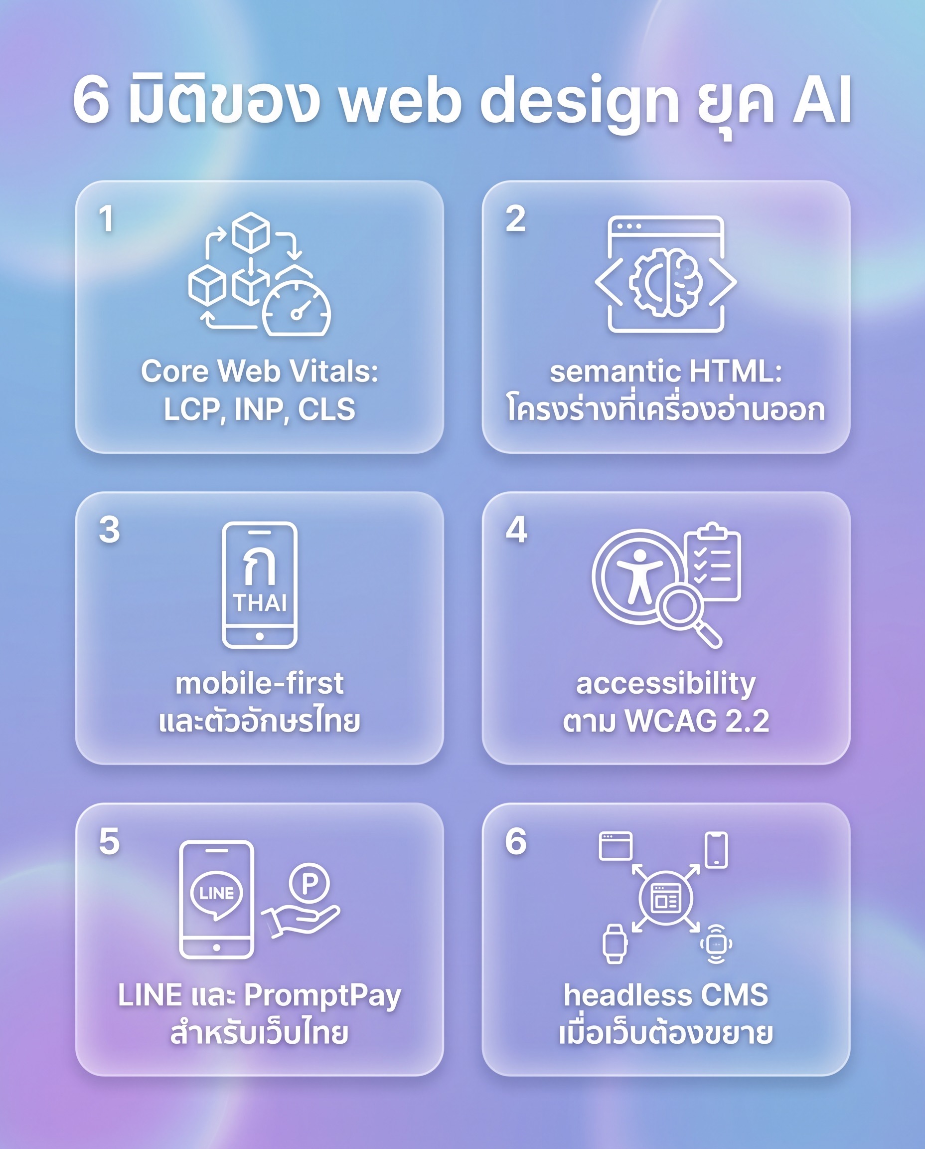
The table below summarises what each of the six dimensions changes for a human visitor, and what it changes for the systems that read the page instead of looking at it.
| Dimension | What the visitor gets | What crawlers and AI get |
|---|---|---|
| Core Web Vitals | Fast first paint, taps that respond, buttons that do not move as you press them | Field experience signals assessed at the 75th percentile, mobile and desktop separately |
| Semantic HTML | Screen reader users can jump straight to the section they want | A document outline and heading order that need no guessing from visual position |
| Mobile first and Thai typography | No mid word line breaks, no clipped tone marks, no mis taps | Real selectable text that can be quoted, instead of words baked into an image |
| Accessibility to WCAG 2.2 | Keyboard operation, readable contrast in sunlight and high contrast modes | Labels, button names and alternative text become data a machine understands |
| LINE, PromptPay and headless CMS | Chat and payment in a few taps without leaving the path | One content set published to many surfaces, so brand facts never contradict each other |
Eight parts of a landing page that converts
Landing pages that work are rarely the ones with the cleverest effects. They are the complete ones. Each part below has a job and answers a different question in the reader's head.
- Hero. The area seen before any scrolling. Its job is to say in one line what this is, who it is for, and what to do next. A headline like "taking you further" leaves the reader still not knowing what is being sold. Write it as real text in the markup rather than as words inside an image.
- Social proof. Client logos, years in operation, certifications or awards that genuinely exist, placed near the hero so hesitation drops early. The requirement is that every item is verifiable. Invented numbers are worse than no numbers.
- The unique selling point. Why this provider rather than the alternatives the reader is actually weighing, including the alternative of doing nothing. It can be short, but it has to be specific enough that a competitor could not paste it onto their own page.
- Feature explanation. What the product or service does, with each capability tied to the outcome it produces for the reader. This is the section people scan rather than read, so it suits subheadings and lists.
- Testimonial. A quote from a named customer with enough context to be checked carries weight that an anonymous compliment does not. A photo or organisation name makes it more checkable still.
- FAQ. The questions that stop people from deciding: price, timeline, cancellation terms, what happens after signature. Writing each question as a subheading and answering it in the first sentence helps the reader and the systems that lift answers out of pages.
- Sticky CTA. On mobile, a persistent contact button removes the need to scroll back up. The caution is that it must not cover content or the element that currently has keyboard focus, which is an accessibility failure rather than a matter of taste.
- Exit intent. An offer shown when someone is about to leave or has gone idle. It earns its place only when what is offered has real value, such as a quotation or a comparison guide. A popup asking for an email address in exchange for nothing simply speeds up the exit.
What makes a page easy for AI search to read
An AI system that answers questions from web content works in stages. It has to reach the page, parse the structure, isolate passages that answer something, and then decide which passage to quote and credit. Pages that get quoted often share a few traits.
The first is structured data for AI search written as JSON-LD, a format that describes the page in data a machine reads directly, kept separate from the prose a person reads. The types that earn their place on a business site are Organization for the company, WebSite for the site, BreadcrumbList for the navigation path, Service for each service page, FAQPage for a question set, and Article for editorial content. None of it improves the content. It removes the need to interpret what the content already says.
The second is entity consistency. The legal company name, address, phone number and links to official profiles have to be written the same way everywhere. When the contact page says one thing, the footer says another and an external profile says a third, a system cannot be confident all three describe one organisation, and that uncertainty turns into not being cited.
The third is the shape of the writing. A passage that quotes well is one that makes sense on its own without the paragraph before it. The technique is to make subheadings the questions people actually ask and answer each one in the first sentence underneath, then add nuance. Avoid phrases like "as mentioned above", because once the passage is lifted out on its own it refers to something that is not there. Real tables with real header cells and real list markup are read more reliably than text arranged into columns with CSS.
The fourth is reachability. If the text only appears after client side JavaScript runs, that is an extra step some retrieval systems do not perform. Sending complete HTML from the server is the safer default, and it is the mechanical core of GEO for AI search, which aims at being cited inside answers rather than only ranking in a list of links.
Five mistakes common on Thai brand sites
- Thai text baked into the hero image, usually to get a specific font and free layout. That text cannot be found, copied, translated or read aloud, and the large image becomes the element that defines the page's LCP. Fix it by setting real text over a background image.
- Headings built from styled generic containers instead of h2 and h3. The page then has no outline at all from a machine's point of view. A carefully written question and answer section has no boundaries a system can detect, so the whole set loses any chance of being surfaced as an answer.
- Contact details living only in an image or only inside chat. A phone number rendered as pixels cannot be read, cannot be tapped to call, and cannot be assembled into organisation data. When those details also disagree with what external profiles say, nothing can confirm it is all one brand.
- Line height and fonts inherited from an English template with no Thai adjustment. Tone marks get clipped or collide, and when the primary font lacks the full Thai set the browser swaps to a fallback after load, which moves the text and damages the CLS score at the same time.
- Relaunching on new URLs with no redirects. Every external link pointing at the old addresses and every page that had accumulated ranking turns into a not found error, and years of value disappear in a day. Build a mapping table from every old address that gets real traffic to its new home before launch day, not after.
What this means for Thai brand sites specifically
A bilingual Thai site carries work that generic guides never mention. Start with addresses. If Thai language URLs are used, they need to be used consistently, and the address declared in the sitemap has to match the address declared as canonical character for character, because Thai characters can be encoded in more than one form and the two files drift apart easily. Next come the language pairings. A Thai page and its English counterpart must point at each other in both directions. A one way or mismatched declaration sends visitors to the wrong language version.
Then there is contact behaviour. A Thai site offering only a long form collects fewer leads than one that lets people start a chat immediately, and a site offering only a chat button ends up with information sitting in conversations that nobody turns back into numbers. Running both and measuring both is what actually works. Finally there is pricing content. Many Thai buyers decide on clarity about price and timeline before they decide on visual polish, so stating price ranges and the working process on the service page filters out people who are not ready and brings the ready ones in with sharper questions.
FAQ
Should I rebuild or fix the site I already have?
Fix what you have first whenever the page structure and the back end can still be edited, because it costs less and risks none of the accumulated value. The signals that it is time to rebuild are: content edits that require a developer, a theme or plugin set nobody maintains any more, markup nested so deeply that performance work has nowhere to start, and a system that cannot really handle a second language. More than two of those and rebuilding usually costs less than continued repair. If you do rebuild, prepare the redirect mapping before launch day rather than after.
Is WordPress still a reasonable choice in 2026?
Yes, and it remains sensible for most company and content sites. The performance problems people blame on WordPress usually come from somewhere else: an off the shelf theme that loads everything just in case, a page builder that emits deeply nested containers, and plugins doing overlapping work. With a theme you control, unused assets removed and pages cached, the field numbers can sit comfortably in range. WordPress stops being the economical answer when one content set has to feed several destinations or when many editors work simultaneously, and that is the point at which a headless CMS deserves a look.
How long after launch before a new site shows results in search?
There is no fixed number, and anyone guaranteeing results in weeks deserves a hard question. What is predictable is the order of events. Pages have to be indexed, then impressions start appearing in reporting, and only then do positions move according to content quality and the links pointing in. If the relaunch also changed URLs, expect the numbers to swing before they settle. The useful habit in the first months is reading indexing reports and field data weekly instead of watching rank alone.
If the content is already good, do I still need structured data?
Yes, because structured data does not substitute for content. It tells a machine what the content already says: which name is the organisation, which number is the price, and which paragraph answers which question. Removing the need to interpret raises the chance the content gets used correctly. The rule to respect is that the declared data has to match what is visible on the page. Declaring questions and answers that do not appear on the page is declaring something false.
What should I check after the site goes live?
Check four things in the first week. Whether every important page has actually been indexed. The field values for LCP, INP and CLS, read separately for mobile and desktop. That every old address redirects to the right new one, with no not found errors and no chains of redirects. And that the contact actions and the payment steps work on several real phones rather than only on the device the team tested with.
Where to start
If you are about to commission a new site, turn the six dimensions above into headings in the scope of work and ask the team how each one will be measured after launch. A good answer talks about field data, heading structure and keyboard testing, rather than only page counts and revision rounds. If you already have a site and want to know how far it sits from the current bar, check three things: the field values from real visitors, the heading order on your most important pages, and Thai typography on a phone. Relevant Audience works on web design in Bangkok alongside search and content, so if you want a read on where the current site is losing people before you decide to rebuild it, get in touch.