TL;DR
- A company logo identifies the legal entity, a brand logo identifies a proposition customers buy, and a product logo identifies one item; large groups run all three deliberately so a problem in one product does not spread.
- Every logo is built from one of five structures: wordmark, lettermark, pictorial, abstract or combination, and the choice follows from the name and existing recognition rather than taste.
- The seven principles become useful only as tests: describe it aloud and have someone draw it, sketch it from memory after five seconds, strip every effect, render it at 16 pixels and in one colour.
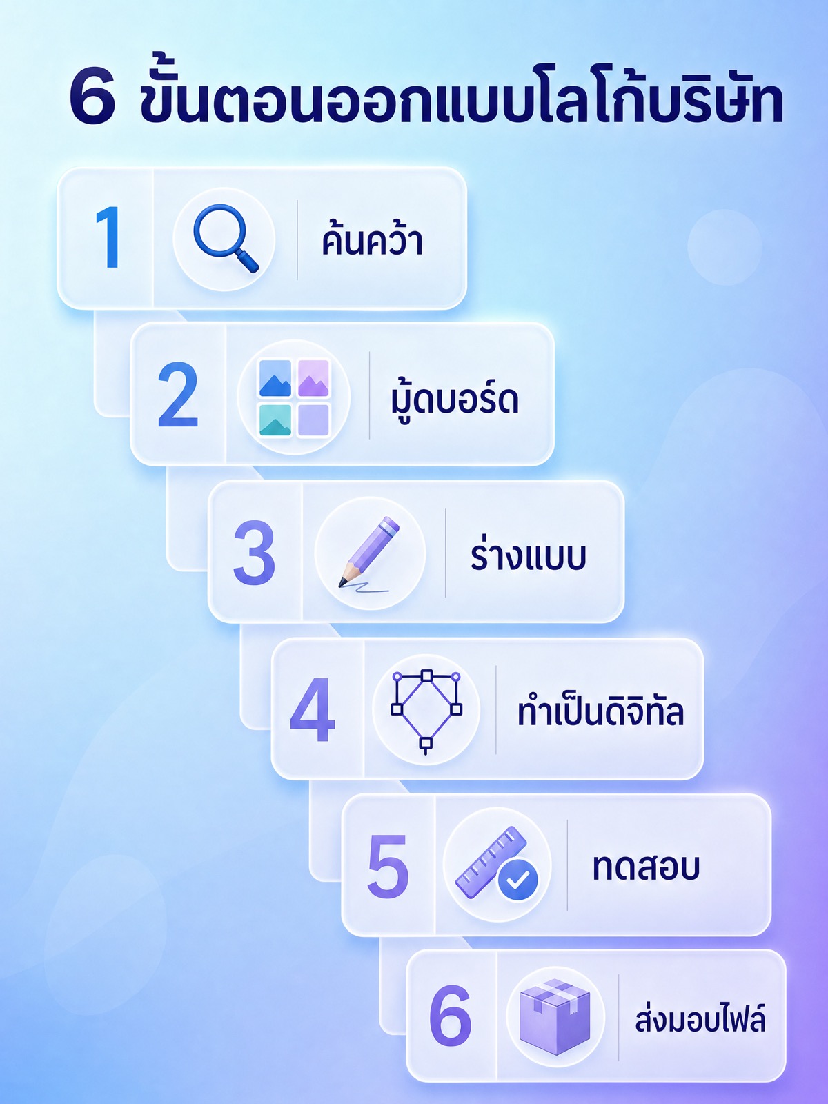
- The six steps each produce an artefact: a written brief, two or three directions, paper sketches, vector construction, test evidence, then a file kit with usage rules.
- A logo used commercially can be registered as a trademark with Thailand's Department of Intellectual Property, distinctiveness affects registrability, and current requirements should be confirmed with the department or a trademark agent.
Company logo design is the work of turning what an organisation does into one mark that people recognise before they read a single word of copy. It is a process with stages, not a drawing session: research produces a brief, the brief produces directions, the directions produce sketches, the sketches produce a vector construction, the construction gets tested at the sizes and in the materials it will actually live in, and the project ends with a file kit and a set of usage rules.
This guide explains how that process works. It covers the difference between a company logo, a brand logo and a product logo, the five structural types of mark, the seven principles a good logo has to satisfy and how to test each of them, the six steps of a working process and what each step produces, what a Thai company has to plan for when the mark must sit in both Thai and Latin script, and why the question of trademark registration belongs at the start of the project rather than the end. Choosing and briefing a design team is a separate subject with its own guide, so it is not repeated here.
Why a logo carries more weight than its size suggests
A logo is small, cheap to reproduce and usually the least detailed thing a company owns, and it still does more identification work than any other asset. That is because of where it appears. It sits in the browser tab before the page loads, in the corner of an invoice, on the delivery van in traffic, on a shop sign read from across a road, on a phone screen in a list of a hundred other icons, and on a name badge at an event. In every one of those places the viewer is not reading. They are matching a shape against memory. The mark either resolves into "that company" in under a second or it does nothing.
This is why a logo is not the same thing as a brand, and why treating them as interchangeable causes so much wasted work. A brand is the whole set of associations a person holds about a company: what it sells, how it behaves, what it costs, whether a problem got fixed the last time. The logo is the shortcut that retrieves those associations. It cannot create them. A mark on a company that nobody has dealt with is an empty container, and no amount of design craft fills it. What good design does is make the container easy to recognise, easy to reproduce, and hard to confuse with a competitor's, so that every impression the company earns is filed under the right name instead of leaking to someone else.
The practical consequence is a change in what you optimise for. If the job were decoration, you would ask whether the mark is attractive. Since the job is retrieval, you ask whether it is distinguishable from the marks it will be seen next to, whether it survives the worst reproduction it will face, and whether it still reads as the same mark in five years when the rest of the company's brand identity has been refreshed around it. Attractiveness is a constraint, not the objective.
There is a second consequence for how a mark is judged. The people approving a logo see it at A3 on a screen, in isolation, forty times over three weeks. Customers see it at thumbnail size, surrounded by noise, for a fraction of a second, and they see it once before they need to recognise it again. Almost every bad decision in logo approval comes from that gap. A shape that looks plain in a presentation deck is often exactly the shape that survives the delivery van and the favicon, and a detailed illustration that wins the meeting is often the one that turns into a grey smudge at 16 pixels.
Company logo, brand logo and product logo are three different jobs
Most confusion in a logo project comes from not agreeing which mark is being designed. A company logo identifies the legal entity that employs people, signs contracts and files accounts. A brand logo identifies a commercial proposition that customers buy into, which may or may not carry the company's name. A product logo identifies a specific item or line inside a brand, and it lives mostly on packaging, labels and product interfaces.
Large groups routinely run all three at once. A food conglomerate whose corporate mark appears on its head office, its annual report and its recruitment materials may put an entirely different mark on the front of each product line it owns, and a third mark on individual products within a line. The shopper buying a packet in a convenience store recognises the product mark, may recognise the brand mark, and has often never seen the corporate mark at all. That is not an accident of history. It is a deliberate structure that keeps a problem in one product from spreading to every other product the group sells, and it means the corporate mark is designed for a different audience with different priorities: investors, partners, regulators and job candidates rather than shoppers.
Small companies get this wrong in the other direction. A single mark is asked to serve as company identity, brand identity and product identity at once, which is usually correct at that size, but the brief still has to say so out loud. If the mark will one day appear on a product label as well as an office door, that changes the file requirements, the minimum size and the colour system before any sketching starts. Deciding it afterwards means redrawing.
The table below sets out where each type of mark actually appears and what it is trying to make someone remember. Use it in the first meeting of a project to settle which mark is being commissioned.
| Type of mark | Where it mainly appears | What it needs the viewer to recognise |
|---|---|---|
| Company logo | Office signage, contracts and quotations, annual reports, recruitment pages, staff uniforms, email footers, the About section of a website | The organisation behind everything else, for partners, investors, suppliers, regulators and job candidates |
| Brand logo | Advertising, shopfronts, social profiles, campaign creative, the front of packaging for a whole product line | A commercial proposition a customer chooses, often without knowing which company owns it |
| Product logo | Product labels, the product itself, app icons and in-product screens, spare parts and accessories, retail shelf edge | One specific item, model or variant, so a repeat buyer can find the same one again |
| Sub-brand or campaign mark | Seasonal campaigns, events, sponsorships, limited editions, internal programmes | A temporary or narrower proposition, usually shown alongside the parent mark rather than replacing it |
The five structural types of logo
Every logo is built from one of five structures. The choice is not a style preference. It follows from the name, from how much recognition the company already has, and from where the mark has to appear.
- Wordmark. The full name set as the mark, with the typography itself carrying the distinctiveness through custom letterforms, adjusted spacing or one modified character. It works when the name is short, pronounceable and already distinctive, and it has the advantage that seeing the mark teaches the name. It fails when the name is long, when it is a generic description of the category, or when the mark has to fit a square avatar crop where a wide word becomes unreadable.
- Lettermark. Initials or a monogram, used when the legal name is long, awkward to say, or a string of founder surnames. It solves the space problem immediately and reproduces well at small sizes. The cost is that initials carry no meaning until people learn them, so a lettermark commits the company to building that association through repeated exposure. A three-letter monogram also collides easily with other three-letter monograms, which makes the originality check harder.
- Pictorial mark. A recognisable object drawn simply: a bird, a leaf, a key, a building silhouette. It communicates immediately because the viewer already knows what the object is, which makes it the fastest type to become meaningful. The risks are literalness and crowding. Every logistics company that draws an arrow, every clinic that draws a cross and every farm brand that draws an ear of rice is drawing what its competitors already drew.
- Abstract mark. A geometric or constructed form that is not a picture of anything. It has no built-in meaning, which is the point: it cannot be misread as the wrong category, and it can hold whatever meaning the company earns over time. It demands the most patience, because on the day it launches it says nothing, and it demands the most craft, because there is no familiar object propping up the shape.
- Combination mark. A symbol and a wordmark locked together, which is what most companies end up with. It gives the recognition of a symbol and the naming of a wordmark, and it is the only structure that gracefully supports different contexts. A combination mark is not one file. It is a family: a horizontal lockup for website headers and letterheads, a stacked lockup for square and narrow spaces, and the symbol alone for favicons, app icons and social avatars once the name is known.
Note what the choice actually depends on. A new company with an unfamiliar name is usually better served by a wordmark or a combination mark, because a symbol alone leaves the audience with nothing to say when they want to recommend it. An established company with a name everyone already knows can afford to let the symbol travel alone. The decision belongs in the research stage, documented with a reason, not settled by whichever concept looks best on a slide.
The seven principles, and how to test each one
Every list of logo principles contains roughly the same seven adjectives. Adjectives do not help anyone decide between two options in a review meeting. What helps is a test that produces a yes or a no. Below is each principle with the test that turns it into evidence.
- Simple. Simplicity means the mark has as few distinct elements as it can have and still be itself. Test it by describing the mark out loud to someone who has never seen it, with no gestures, and asking them to draw it. If the description needs more than a sentence or two, or if their drawing is unrecognisable, the mark has more parts than a viewer can hold. A second test: count the closed shapes and the strokes. Detail that disappears at small sizes is not detail, it is dirt.
- Memorable. Memorability means the shape has one feature distinctive enough to be recalled without being looked at again. Test it by showing the mark for five seconds to someone unfamiliar with it, taking it away, waiting a few minutes and asking them to sketch it. What they draw is what the mark actually is. If everyone draws the same rough shape, that shape is the logo and everything else is decoration you could probably remove.
- Timeless. Timelessness means the mark does not depend on a technique that dates it. Test it by listing every effect in the design and asking whether each one is a decision or a fashion: gradients, drop shadows, bevels, ultra-thin strokes, a typeface currently on every deck. Then strip all of them and see whether the underlying shape still works. If the mark collapses when the effects come off, the effects were the design, and the mark will look old as soon as the fashion moves.
- Versatile. Versatility means the mark survives every reproduction it will meet, most of which are worse than a screen. Test it by rendering it at 16 pixels for a favicon, printing it in one colour, printing it in reverse as white on a dark ground, having it stitched onto a polo shirt, engraving it, faxing or photocopying it, placing it over a photograph, and cropping it into a circular avatar. Anything that vanishes, fills in or breaks at those sizes has to be fixed in the drawing, not compensated for later with a special version.
- Appropriate. Appropriateness means the mark's tone matches what the category needs the viewer to feel, which is not the same as matching what the category already looks like. Test it by showing the mark to people in the target audience with no context and asking what kind of company they think it belongs to. A mark for an industrial parts supplier that reads as a children's brand has failed regardless of how well drawn it is. Appropriate does not mean conventional, and a mark that could belong to any company in the sector has failed a different test.
- Meaningful. Meaningfulness means the form connects to something true about the company, and that the connection still holds once it is explained. Test it by writing the rationale in two sentences and reading it back without the picture. If the rationale only works as a story told over the design, or if it relies on a hidden shape nobody notices, it is decoration with a caption. The strongest meaning is usually structural rather than symbolic: a mark built from the same geometry as the products, or from the initial of the name, needs no unlocking.
- Original. Originality means the mark is not already in use, not a stock icon with the colours changed, and not the category cliché. Test it by searching image libraries for the concept, by looking at the marks of every direct competitor side by side with yours at thumbnail size, and by having a trademark search run before the mark goes into production. Two marks that look different at presentation size can be indistinguishable in a phone notification, and that is the size that matters.
These tests conflict with each other on purpose. Simplicity fights meaningfulness, originality fights appropriateness, and versatility limits how much of either you can have. A logo is the settlement between them, which is why the reasoning behind the settlement should be written down. Six months later, when someone asks why the mark does not include the founding year and a picture of the factory, the written reasoning is the only defence the mark has.
The six-step company logo design process
This is the logo design process most working studios follow, described by what each step produces and what the company has to supply for the step to happen at all. A step that does not produce an artefact is a meeting, not a stage.
- Research. Produces a written brief: what the company does and for whom, how it wants to be positioned relative to named competitors, an audit of those competitors' marks viewed at the sizes customers see them, a complete list of every surface the mark must appear on, and the names of the people who can approve. The company supplies its own structure (which entity, which brands, which products), existing materials, any constraints that are non-negotiable such as a colour already owned or a name that cannot change, and an honest account of what it does not want. The most valuable item in this step is the list of surfaces, because it silently sets the minimum size, the number of lockups and the colour system.
- Moodboard and direction. Produces two or three visual directions, each a collection of references, colour ranges, typographic tone and material examples with a written rationale. These are not logo designs and should not contain any. The point is to agree on territory before anyone spends time on execution, because it is far cheaper to reject a direction than a finished mark. The company supplies reactions, ideally with reasons, and a veto list of anything it will never accept.
- Sketching. Produces a large number of rough thumbnails on paper, narrowed down to a handful of structurally different ideas. Roughness is deliberate: pencil keeps the discussion on structure, where the real decisions are, and stops everyone arguing about a shade of blue while the underlying shape is still wrong. The company supplies patience and the discipline not to comment on colour or finish at this stage.
- Digital construction. Produces the mark as vector artwork built on a grid, with the curves drawn rather than traced, the spacing optically corrected rather than mathematically equal, and the typography either custom-drawn or set in a licensed typeface with the licence checked for logo use. This is where the colour system is defined for screen and for print, where a single-colour version is drawn as its own piece of artwork rather than generated by removing colour, and where the lockups are built. The company supplies its printing and production realities: what its signage supplier can produce, what its packaging is printed in, whether embroidery is involved.
- Testing. Produces evidence. The mark is rendered at favicon size, in one colour, in reverse, over photographs, at signage distance, in the app icon crop and on the actual materials where those are available, and the recall and description tests from the previous section are run with people outside the project. Testing also covers the availability check: a search for conflicting marks before anything goes to production. The company supplies access to real contexts, and the willingness to hear that the favourite option failed.
- Delivery. Produces the file kit and the rules, which together are the actual deliverable. The kit contains vector master files, exported formats for web and office use, every lockup, the single-colour and reversed versions, and a favicon and app icon set. The rules document specifies clear space, minimum size in pixels and in millimetres, the colour values for each output method, what may never be done to the mark, and how the mark pairs with the typefaces and the rest of the identity system. The company supplies a decision on where the files will live so that in two years the sales team is not emailing a screenshot of the logo to a printer.
Two things about this sequence are worth stating plainly. First, the order matters more than the number of steps: research before direction, direction before sketching, structure before colour, testing before delivery. Skipping backwards is what produces a mark that has to be redrawn a year later. Second, the outcome of the process is not one image. It is a small system, and the rules that come with it are what keeps the mark consistent once it leaves the designers and enters the hands of everyone who will ever put it on a slide. That system is the piece that connects to the rest of a company's graphic design work, from templates to packaging.
What a Thai company has to plan for: two scripts, one mark
A mark that has to work in Thai and in Latin script is a harder design problem than a mark in either script alone, and the constraint has to be in the brief from the first day. Retrofitting a Thai version onto a mark drawn in Latin letters almost always produces something that looks bolted on, because the two scripts do not share a vertical structure.
- Thai occupies more vertical space. Vowels sit above and below the base letters and tone marks sit above the upper vowels, so a Thai word can stack across several levels while a Latin word stays between two. Matching the two scripts by making their bounding boxes the same height makes the Thai base letters look small next to the Latin. The adjustment has to be made optically, by matching the weight and the apparent size of the base letters, and then the clear space rule around the whole lockup has to be measured from the highest tone mark rather than from the top of the base letters, or the mark will look cramped in exactly the places it is used most.
- Small sizes punish detail in Thai letterforms. Several Thai characters differ from each other by one small feature, and the loop that begins many letters is the first thing to fill in when a mark is printed small, stitched, engraved or rendered at low resolution. A loopless display face can look clean at presentation size and turn into ambiguous shapes on a business card. This is a reason to test the Thai part of the lockup at the smallest real size before anyone falls in love with the typeface, not after.
- Decide which script leads, and stop there. A bilingual lockup where neither script is subordinate reads as two logos next to each other. Choosing a primary script and treating the other as the secondary line, then defining when each version is used, produces a cleaner system and a shorter rules document. Most Thai companies need at least three lockups: Thai only, Latin only, and both, and the rules have to say which one goes on which surface.
- Check the typeface licence for both scripts. A logo is a commercial use, and Thai and Latin typefaces are usually licensed separately with different terms. Whether a licence permits using the letterforms in a logo, and whether it permits modifying them, is a question for the licence text and the foundry rather than an assumption. Converting text to outlines does not by itself change what the licence allows.
- Pairing matters as much as drawing. A Thai typeface and a Latin typeface that were not designed as a pair rarely match in weight, contrast or apparent size at the same point size. The mark, the website and every template will show that mismatch, which is why the typeface pairing usually gets settled during the logo project and then carries into the rest of the identity system instead of being decided again each time a new asset is made.
Trademark registration: a design constraint, not a closing formality
In Thailand a logo used commercially can be registered as a trademark, and registration through the Department of Intellectual Property is what gives a mark enforceable protection. Using a mark is not the same as owning the right to stop someone else from using something similar. That distinction is the reason registration belongs in the conversation at the research stage rather than after production.
The point that most affects design is distinctiveness. A mark that is essentially a description of the goods or services it is applied to is harder to register than one that is distinctive, because a description is something every competitor in the category has a legitimate need to use. This has a direct consequence for the sketching stage: the most obvious, most literal, most category-typical idea is also the weakest candidate both commercially and legally. Distinctiveness is not decoration. It is the property that makes a mark both memorable and defensible, which is one of the few places where the design test and the legal test point in the same direction.
What follows practically is a sequencing rule. Run an availability check before the mark goes into production, not after the signage is ordered, and if the company operates in Thai and in English, ask a trademark agent whether the versions you intend to use need separate treatment. Beyond that, the specifics of what can be registered, in which classes, on what timeline and at what cost are matters to confirm directly with the Department of Intellectual Property or with a qualified trademark agent, because those requirements change and getting them from an article is not a substitute for checking. This section describes how registration affects design decisions. It is not legal advice, and nothing in it should be relied on as such.
What you should hold at the end of a logo project
A finished project hands over more than a picture. If any of the following is missing, the mark will drift within a year as different people rebuild it from whatever file they happen to have.
- Vector master artwork, from which every other format can be regenerated at any size.
- Every lockup that was agreed: horizontal, stacked, symbol only, Thai, Latin and bilingual as applicable.
- A single-colour version and a reversed version, drawn deliberately rather than produced by a filter.
- Exported files for the places non-designers work: office documents, presentations, email signatures, and a favicon and app icon set at the standard sizes.
- Colour specifications for each output method, so the mark is the same colour on a screen, on a printed brochure and on a painted sign.
- Written rules: clear space, minimum size, approved backgrounds, and a short list of things that must never be done to the mark, with examples of the misuse.
- The typography and the rationale, so the next person to design a template or a page for the logo family does not have to guess.
FAQ
What is the difference between a company logo and a brand logo?
A company logo identifies the legal organisation while a brand logo identifies a commercial proposition that customers buy, and in larger groups they are deliberately different marks aimed at different audiences. The company mark appears on contracts, offices, reports and recruitment; the brand mark appears in advertising, on shopfronts and on packaging. In a small business one mark usually does both jobs, which is fine as long as the brief says so, because serving both purposes changes the minimum size, the file formats and the colour system the mark has to support.
Which of the five logo types should a company choose?
The choice follows from the name and from how much recognition the company already has, not from taste. A short and distinctive name supports a wordmark, a long or awkward legal name pushes towards a lettermark, a concept with an obvious and uncrowded object supports a pictorial mark, and a company willing to build meaning over time can carry an abstract mark. Most companies settle on a combination mark because it is the only structure that gives both a symbol for small spaces and the name for people who have not learned the symbol yet.
Should a logo be designed in colour or in black and white first?
Black and white first, always, because colour hides structural problems and a mark that only works in colour is a mark that fails on every single-colour surface it meets. Working in one colour forces the shape, the spacing and the contrast to do all the work. Colour is added after the structure holds, and the single-colour version is then kept as a real deliverable rather than treated as a fallback, since invoices, stamps, embroidery, engraving and low-quality printing will all use it.
How do you handle a logo that must work in both Thai and English?
Plan the bilingual lockup from the brief rather than adding a Thai version later, and match the two scripts optically rather than by bounding box height. Thai vowels and tone marks stack above and below the base letters, so equal box heights make the Thai look undersized, and the clear space around the lockup has to be measured from the highest mark. Test the Thai part at the smallest real size early, because the loops in many Thai letters fill in first when a mark is printed small or stitched.
Does a company logo have to be registered as a trademark?
Registration is what gives a mark enforceable protection in Thailand, and the Department of Intellectual Property administers it, so a mark you intend to build a business on is worth registering rather than merely using. Distinctiveness affects whether a mark can be registered at all, which is why a purely descriptive mark is a weak candidate both legally and commercially. Confirm the current requirements, classes and procedure with the department or a qualified trademark agent, since this is a legal question and this article is not legal advice.
Where to take this next
If you are about to start a mark, the highest-value hour you can spend is the one before any drawing: write down which of the three marks you are commissioning, list every surface it has to survive, decide whether it has to carry Thai and Latin script, and check that the idea you like most is distinctive enough to be worth registering. Everything after that gets cheaper. If you would rather walk through those decisions with people who do this work daily, the Relevant Audience team can talk through where your mark sits in your wider identity and what the process would involve for your company.