TL;DR
- A mood board is made before design starts and is inspiration, while a style guide and brand guideline come after design and are binding rules.
- A workable board has around 10 to 20 images per direction, plus 4 to 6 colour swatches with HEX codes, heading and body type samples, and 3 to 5 personality keywords.
- Reference images on a mood board are usually copyrighted: use them for internal briefing only, and use newly shot, licensed or original images in published work.
- For Thai brands, test real Thai text on the board, compare looped and loopless Thai fonts, and check the mood in small formats like a LINE OA profile or rich menu.
A mood board is a single page of reference images, colour swatches, type samples, textures and keywords that shows what a piece of design should feel like, before a designer starts drawing a logo, building a web page or shooting photos. Put simply, a mood board settles direction with pictures instead of words, because one person's "premium" or "friendly" is never quite the same as another's.
This guide covers what a mood board is used for, what goes on one, how it differs from a brand guideline and a style guide, how to build one with a designer step by step, which kinds of work it should come before, and which tools to use. It also lists the mistakes that make a mood board useless.
What a mood board is and what it does in design and branding
A mood board is an early-stage project document. It is not the work itself, and it is not a rulebook. Its main job is to make the business side and the designer picture the same thing before anyone puts real hours into production. When this step is skipped, the usual result is that the designer reads the brief one way, the client had something else in mind, and the work goes through round after round of revisions.
In general design work
For graphic work such as posters, packaging or a set of social posts, a mood board locks three things early: the colour palette, the weight of the typography, and the image style (real photography, illustration, 3D or flat graphics). Once those three are clear, the designer's first draft lands much closer to what the client wants, and feedback shifts from "I don't like it but can't say why" to "this colour has drifted off the board", which is far easier to fix.
In brand building
In branding, a mood board translates a written brand personality, such as "warm, sincere, modern", into something people can actually see. "Modern" might mean lots of white space and a loopless sans-serif to one person, while another pictures neon colours and hard-contrast graphics. Putting images next to the words forces everyone to agree on one meaning. Teams working on brand identity often prepare two or three mood board directions to choose from before going deep on the one that is approved.
What a mood board should contain
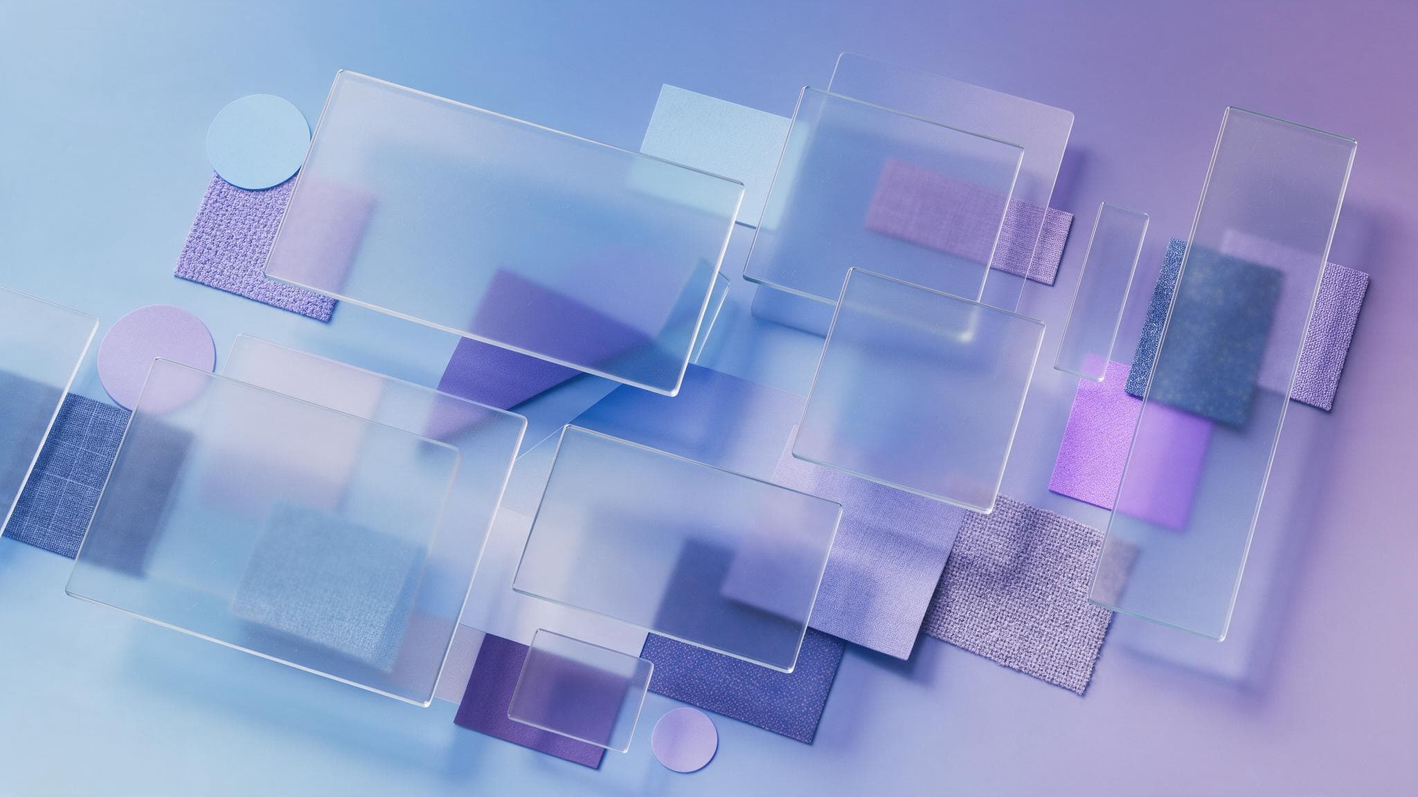
There is no fixed standard for how many images a mood board needs, but boards that work in practice usually include these elements.
- Hero reference images. The photos or pieces of work that capture the mood most directly. One or two should be larger than the rest to signal which images are the anchor.
- A colour palette. Pull 4 to 6 colours out of the reference images as swatches with HEX codes, so the conversation is precise rather than "a sort of light blue".
- Type samples. Samples of the heading font and the body font. If the brand communicates in Thai, include real Thai sample text as well.
- Textures and materials. Kraft paper, linen, polished metal or wood, for example. These matter a great deal for packaging and shop interiors.
- Three to five keywords. Words that describe the personality, such as "calm" or "detail-minded", placed on the board so every image can be checked against them.
- Layout or icon examples. If the board will feed a website or app, include sample page layouts, buttons or icon styles.
- A "not this" section. Some teams keep a small zone showing what they do not want. It removes ambiguity faster than describing only what they do want.
A workable number of images is usually around 10 to 20 per direction. Fewer than that and a pattern may not be visible yet. More than that and the board starts contradicting itself, so nobody can tell which way it points.
How a mood board differs from a brand guideline and a style guide
These three documents are often mixed up, but they belong to different stages and carry different weight. The mood board comes first and is inspiration. The style guide and the brand guideline come after the design is done, and they are rules to follow.
| Document | When it is made and what it is for | How binding it is |
|---|---|---|
| Mood board | Before design starts, to agree on mood, palette and image direction | A direction, not a rule. The images belong to other people and must not be used in the final work |
| Style guide | After design, to set usage details such as heading sizes, spacing and button states | Must be followed in the channels it covers, such as a website or a post series |
| Brand guideline | After the identity is finished, to set rules for logo, colour, type and tone across all channels | Must be followed everywhere, and is what gets handed to other teams or agencies |
In short, the mood board answers "how should this feel?" while the guideline answers "how must this be used?" If a business already has a brand guideline, a mood board for a new campaign should sit inside that guideline's limits rather than invent a rival personality.
How to build a mood board with a designer, step by step
A good mood board is made together. It is not the designer guessing alone, and it is not the client sending 50 images with a note saying "something like this". The process below works for most projects.
- Write a short brief first. State what the work is, where it will be used, who the audience is, and three to five brand personality words. This brief is the filter for every image.
- Collect widely. Both sides gather images that feel right, from photography, architecture, fashion or packaging. They do not need to come from the same industry, because mood carries across categories.
- Cut down hard. Remove duplicates and anything that clashes with the personality words. Ask of every image, "what does this say that the others don't?" If there is no answer, drop it.
- Split into directions. If the images fall into clear groups, separate them into two or three boards. Give each direction a memorable name, such as "Sunday morning" and "the lab".
- Extract colour and type. The designer pulls a palette from the images and picks sample fonts that fit each board's mood.
- Present with reasons. When presenting, explain how each board answers the brief rather than only showing pretty pictures.
- Choose one direction and record it. Once a board is chosen, note the adjustments, for example "board A, but take the green from board B", and treat the board as the yardstick for reviewing the next round.
Illustrative example: a new coffee shop
Illustrative example: a small coffee shop in Bangkok's Ari district needs a logo, a shopfront sign and a LINE Official Account profile. The owner wants it "warm but not old-fashioned". The designer prepares two boards. The first uses natural light, pale wood, handmade ceramics, cream and caramel brown, and a soft looped Thai typeface. The second uses bare concrete, heavy lettering, and brick orange against dark grey. The owner picks the first board but borrows the brick orange from the second as an accent. That decision takes one meeting, and the first round of logo sketches starts from an agreed direction instead of a random spread of styles to choose from.
Using a mood board before logo, website and photography work
A mood board fits almost any kind of project, but what belongs on it changes with the type of work.
Before designing a logo
For logo design, the board should focus on shapes, line weight and lettering more than atmosphere. Include examples of different logo types, such as wordmarks, symbols and emblem or badge styles, to find out which structure the client prefers. One caution: other brands' logos are there to discuss structure only, never as a template to copy, because a logo that resembles someone else's causes problems for recall and for trademarks.
Before designing a website
For web design, the mood board needs more than atmosphere images. It should show page layouts, content density, button styles and illustration style. Some web designers extend the mood board into a style tile, a single page that combines headings, buttons, colours and form fields, before moving on to wireframes or real pages. Check the board on a phone screen too, because many people open websites on mobile, and a mood that looks great on a large display can become hard to read on a small one.
Before a photo or video shoot
Product, food or team photography uses the mood board to brief the photographer, stylist and art director. The board should cover lighting (natural or studio, hard or soft), camera angles, props, background colours and post-production colour grading. The photographer uses it to plan equipment and shooting time. Having a board before the shoot day lowers the chance of a reshoot because the images missed the brief.
Before a social graphics series
For graphic design that has to be produced continuously, such as weekly posts, the board should show how flexible the templates can be. For example, can promotional posts and educational posts share the same colours at different weights? The aim is a feed that looks like one set even when several designers produce it.
Mood board tools
A tool will not make the board better on its own, but matching it to how the team works saves time.
- Pinterest suits the wide-collection stage. You can create boards of pins, make a board secret, and invite others to collect images on the same board. The limit is that you cannot freely arrange images into a layout, so it is usually a store of raw material rather than a presentation board.
- Canva has mood board templates to start from. You can drag in images, add colour swatches and type samples, and share a link for others to view or edit. It suits business owners who want a rough board before handing over to a designer.
- Figma and FigJam provide a wide canvas where several people can work at once and leave comments on specific spots. They suit teams that will carry the mood board forward into website or app design in the same file.
- Milanote is built specifically for visual boards. You can place images, notes, links and colour swatches freely on a board, and it has a browser extension for saving images from the web into a board.
- A physical board still works well where materials matter, such as packaging or shop interiors, because fabric, paper and colour chips you can touch give information a screen cannot.
Mistakes that make a mood board fail
- Adding everything you like. A board full of beautiful images pointing in different directions makes the designer guess which ones matter more. The result is middle-of-the-road work with no clear direction.
- Using only work from your own industry. If every image comes from competitors in the same market, the result will look like everyone else in that market. Borrowing mood from other industries is what helps a brand stand apart.
- No annotations. The same image might be chosen for its colour, its light or its composition. Without a note saying what you like about it, the designer may pick up the wrong element.
- Forgetting to check Thai. An English font that looks great on the board may have no Thai glyphs, or Thai glyphs that do not match. Test with real Thai text at the board stage.
- Using board images in the final work. Most reference images are copyrighted. They are fine for internal communication, but published work needs newly shot, licensed or original images.
- Changing the board midway. If the board is approved and the direction then changes after drafts are seen, most of the work done so far usually has to start over. If a change is truly needed, go back and redo the board first rather than requesting endless revisions to the drafts.
The limits of a mood board
A mood board communicates mood well, but it does not tell you everything. It does not prove the target audience will like the result, it does not show whether a logo stays legible when shrunk to icon size, and it does not check whether the chosen colours have enough contrast for readable text on a website. Those things have to be tested during actual design. A very polished board can also raise expectations the project's budget or timeline cannot meet, for example a board full of magazine-grade photography on a project with no budget for a new shoot. So talk about scope alongside the board from the start.
Mood boards in the Thai market: extra things to consider
For brands that speak to Thai audiences, there are details a board built from overseas references tends to miss.
- Looped and loopless Thai fonts. Looped Thai typefaces feel more formal and read well in long text. Loopless ones look more modern, but some are hard to read at small sizes. The board should include both a heading and a paragraph sample in Thai.
- Thai text length and spacing. Thai has vowels and tone marks above and below the line, so it needs more line spacing than English. A layout that looks airy in an English reference can get crowded once Thai text goes in.
- The channels actually used. Many Thai brands communicate through LINE Official Account, Facebook and TikTok. Check whether the chosen mood still reads in a small profile picture, a rich menu or a vertical cover image.
- Colour and cultural meaning. Some colours carry specific meanings in a Thai context, such as colours tied to days of the week or to festivals. Think about how the brand's main colours will work during festivals like Songkran or Chinese New Year.
- People and setting. Overseas references may show light, clothing and places that do not match the lives of Thai customers. If the brand will use photos of people, include references closer to the real local context.
Mood board FAQ
What is a mood board, in short?
A mood board is a collection of images, colours, fonts and textures used to agree on the mood and direction of a design before the real work starts. It helps the client and designer mean the same thing by words like "premium" or "bright".
How is a mood board different from a brand guideline?
A mood board is made before design as inspiration, while a brand guideline is made after the design is finished and sets binding rules for logo, colour and font use. The images on a mood board usually belong to others, but everything in a guideline belongs to the brand.
How many images should a mood board have?
Around 10 to 20 images per direction is generally enough. Too few and no pattern shows, too many and the board starts contradicting itself. If you love images that point another way, put them on a separate board.
Should I make a mood board myself before hiring a designer?
Yes, it is useful, because it helps the designer understand your taste faster. Treat it as raw material, not a final instruction, since the designer may cut, trim and rearrange it to fit the brief and the audience.
Can I use Pinterest images on a mood board?
You can use them for internal reference, but not in published work, because most of those images are copyrighted. Final work needs newly shot, licensed or original images.
Start from a board everyone agrees on
If you are about to start a logo, a brand refresh or a new website, time spent on a mood board at the start gets everyone speaking the same language. If you want a design team to handle the project, see the graphic design service and the brand identity service from Relevant Audience, then get in touch to discuss scope.