According to statistics compiled by Statista, today as many as 51.92% of people prefer using mobile phones to visit websites when compared with all internet users, a figure more than half above the rate of usage on desktops or computers. This naturally means that the online marketing plans of most marketers who have not yet optimized their websites for display on mobile devices urgently need to adapt.
So in this article, we have brought along some great tips from the Digital Marketing Institute, namely 3 ways that will help marketers be ready to face a marketing world where the Mobile First trend is currently all the rage. If you are ready, let's dive in.
1. Optimize your text
For content on a website, text or letters are of course one of the most important elements. So before restructuring your content so that readers can consume it in the best possible way, you first need to understand how content on mobile and content on desktop differ, as follows:
Reading patterns
There is experimental research on reading patterns based on reading content on desktop, which found that there are 2 patterns in total.
That said, when it comes to mobile screens, which are smaller, as in the example Heatmap image above, you will find that around 68% of readers direct their attention to the central area and the upper half of the screen. However, the best recommendation for how to improve your content is to optimize every part of the article as much as possible, as follows:
- Headline The Headline, or title, is one of the most important elements of article-type content. Fundamentally, the title should be able to stimulate the audience's interest and, if possible, must describe the overall content concisely. In addition, if the article has multiple headings, the structure must be laid out clearly, indicating what is the main heading and what is a subheading, in order to create a better experience for readers.
- Summary For the summary, it does not always have to be at the very end of the article, because fundamentally most mobile users tend to want content that is concise and to the point. Therefore, writing a concise summary right from the start helps readers stay on the web page for longer.
- Body The content should be divided neatly to make it easy to read, because text content displayed on a phone has the potential to create frustration for the audience through poorly arranged content, making it feel hard to read. So breaking up the page with images, subheadings, or short paragraphs helps make the content that appears look more appealing.
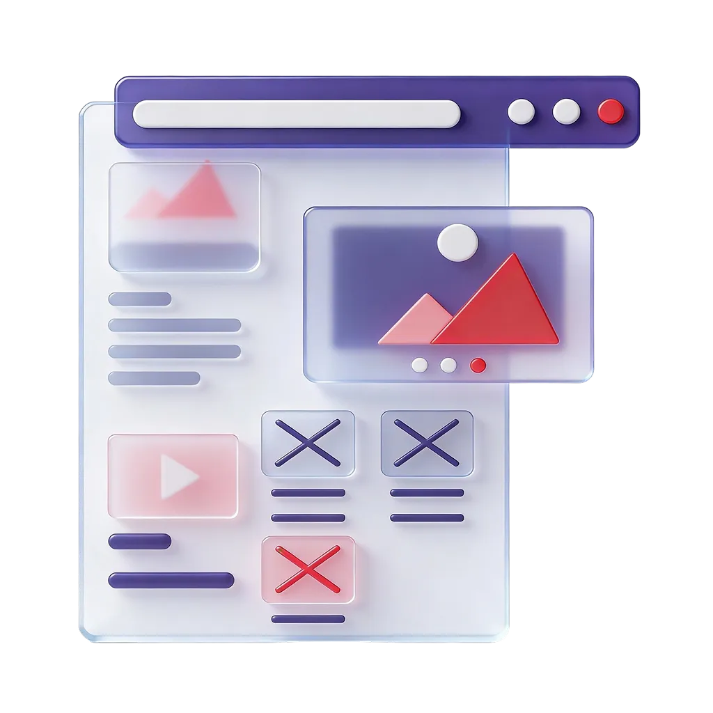
2. Optimize your image files
One of the tips that helps make an article look more appealing and attract readers to stay on the web page longer is the use of various media, whether images or videos. But you must also perform Image Optimization to make them suitable for display on mobile devices, otherwise the website may become slow, laggy, and stuttering, affecting the reading experience of the audience. For some basic tips, you can do the following:
- Compression As mentioned, file size is the most important matter, especially image files, where the sharper they are, the larger the file size becomes. The solution to this problem is very simple, thanks to various tools that have been developed to compress and reduce the size of images while still preserving the image's Resolution, such as TinyPNG, Affinity Photo, Pixlr, ImageCompressor, and so on.
- Resize images appropriately Many websites tend to fall down on basics like resizing images appropriately, because besides the fact that correct image sizes help with beautiful display, they also help reduce the enormous excess resource consumption on the web page. For ready-made tools used to resize images, there is, for example, Embed.ly.
3. Optimize your design
Just text and images alone are not enough for the best display on mobile; you also need to adjust the website's design following additional technical steps so that the content can be displayed on mobile in the best possible way. The tips we have brought to share are as follows:
Responsive Web Design
Responsive Web Design is a design concept for web pages that can be displayed appropriately on different devices. Many people often confuse website design between the Responsive and Mobile Version approaches. To compare it in an easy-to-understand way, Responsive is like a free-size suit, whereas a Mobile Version is like a Tailor Made suit, that is, designed specifically for that particular mobile phone device.
Of course, in the current website design trend, no one designs websites separately for each device anymore, because don't forget that today both mobile phones and tablets come in many models and many brands, which makes designing a website as a Mobile Version not a good solution and, on top of that, wastes budget and time for no benefit. Therefore, designing a website using Responsive Design is a technique that meets the needs of both the website developer and the audience. However, the tip is that you must always test the website on screens of various sizes before actual use, to make sure that the website will not have any display errors.
As a brand and a marketer, adapting to the trends of new marketing developments is important, in order to ensure that your content can always deliver an excellent viewing experience to users.
Get Digital Marketing consultation at Relevant Audience
Relevant Audience is a company that provides services as a Digital Performance Marketing Agency, with the main goal of providing digital marketing services to help businesses reach their target audiences who are looking for products or services at the right time, place, and device, through various online channels. Our services cover Search Marketing, Social Media Ads, Search Ads, and SEO (Search Engine Optimization), all the way to Influencer Marketing, and we are also part of the Google Partners program.
For more information
Tel.: 02-038-5055
Email: info@relevantaudience.com
Website: www.relevantaudience.com