TL;DR
- Brand identity is the logo, colour palette, type system, imagery and tone of voice. The brand book is the document that turns all of it into rules, with an owner, a version number and a procedure for exceptions.
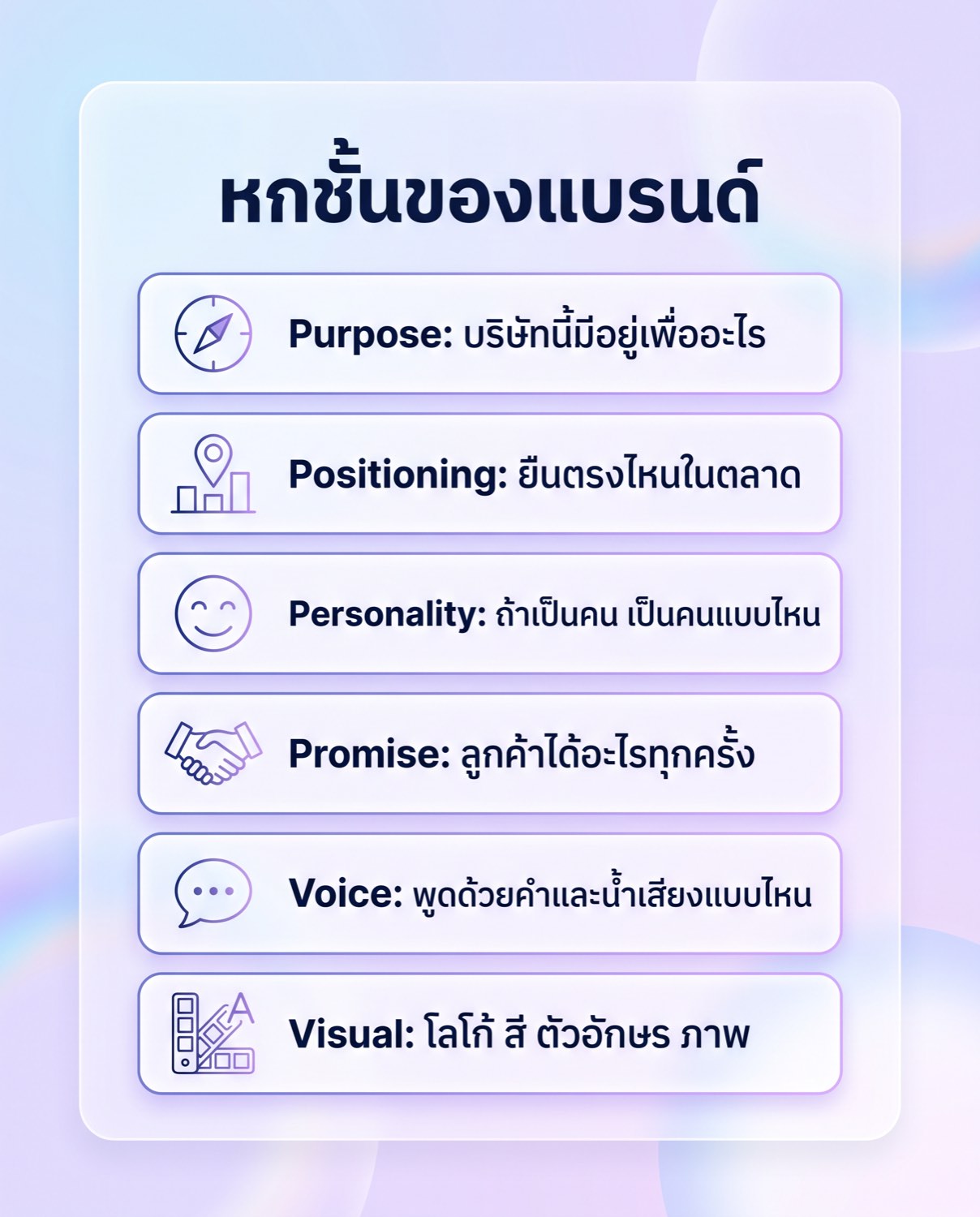
- Build identity in six layers: purpose, positioning, personality, promise, voice, then visual. Skip a layer and the failure shows up in the layer above it, not in the one that was skipped.
- A usable brand book specifies HEX, RGB, CMYK and Pantone values, logo clear space and minimum size in both pixels and millimetres, a full type hierarchy, photography direction, icon rules and a misuse list.
- Thai typography needs its own settings: a size compensation for shorter Thai letterforms, a minimum line height so tone marks are not clipped, and a Thai face that carries the weights the Latin family uses.
- Rebrand on a business trigger such as a merger, a change of core customer or an identity that fails technically. Review the brand book once a year instead of rebranding on a schedule.
Brand identity is the set of things that make people recognise a company and understand where it stands, from the name, logo, colours, typefaces, photography and icons through to the tone it uses when it talks to customers. A brand book is the document that collects all of those elements into rules people can actually work from: what each element looks like, when it is used, what is forbidden, and who decides when a situation the rules never covered comes up. This article separates brand strategy, brand identity, brand book and style guide, sets out what goes inside each document, and explains why fast-growing Thai brands need to write these things down before they grow any further.
A brand that scales is a brand that has written itself down
When a company has ten people, keeping the brand in the founder's head still works. The founder sees every piece before it goes out and can answer on the spot whether a colour is right or whether a sentence sounds like the company. Once there are fifty staff, two agencies, a printer, a sign maker, a monthly freelance content writer and a sales team building its own slides every week, that question comes up dozens of times a day and cannot be routed to the founder each time. What happens instead is that everybody guesses, and the guesses do not match.
The damage does not arrive as one disaster. It arrives as small distortions that accumulate. The new branch sign comes out a deeper red than the website because the sign maker mixed the colour from a photo of an old brochure instead of being given a colour code. The latest ad set uses a different Thai typeface from the app because the freelancer never received the font files the company licensed. The social team calls customers by a familiar pronoun while sales emails use a formal one. Nobody broke a rule, because no rule was ever written.
Documenting a brand is not paperwork for the sake of appearances. It moves knowledge out of a few people's heads and into a place thirty people can use at once. There is one test of whether the document set works: somebody on their first day, or a supplier who has never spoken to the brand owner, opens it and produces work that passes review the first time. If they still have to ask questions on every job, the document is not finished.
Brand strategy, brand identity, brand book and style guide are not the same thing
These four terms get used interchangeably, which is how companies end up buying the wrong item. They pay for brand strategy and expect logo files, or they pay for a logo and expect an answer about how the company should position itself. The simplest way to separate them is to notice that each document answers a different question and has a different group of people using it.
Brand strategy answers what the company is going to win with. It covers the target customer, the competitors, the position, the reason a customer should choose this company, and the things the company will not do. It belongs to management and marketing, not to designers. Brand identity translates that strategy into things you can see and hear: the logo, the colour palette, the type system, the image direction and the way the brand speaks. The brand book binds both of those together with rules for use, and the style guide is the most granular part of that book, the tables of values a person can copy straight into their work, such as colour codes, type sizes and the clear space around the logo.
The table below sets out what each of the four documents answers and who opens it most often in a given week.
| Document | Question it answers | Who uses it most |
|---|---|---|
| Brand strategy | Who do we sell to, who do we compete with, and what do we win on | Management, marketing, product teams |
| Brand identity | What does this brand look and sound like | Designers, content teams, agencies |
| Brand book | How do we use the brand correctly on any job | Everybody internally, suppliers, partners |
| Style guide | What exact values do I type in | Graphic designers, developers, printers, sign makers |
The most expensive mistake is skipping brand strategy and jumping straight to brand identity. With no answer about who the company sells to and how it differs from competitors, choosing colours and typefaces becomes a matter of taste in a meeting room, and the loudest voice wins. Six months later that person leaves and the whole thing is torn up again.
The six layers of a brand, from purpose to visual
The way that holds up in practice is to build brand identity from the inside out. Each layer answers its own question, each one is written down in a different form, and skipping a layer always shows up as a failure in the layer above it, not in the layer that was skipped.
Layer 1, purpose: why this company exists
Purpose answers what customers would lose, and could not get elsewhere, if the company disappeared tomorrow. It is written as one short paragraph plus three to five values, each phrased so that it can actually decide something. Instead of writing that you care about customers, write that when you are not sure a customer will benefit, you turn the job down. A value nobody could argue with is a value that has never helped anyone choose. Skip this layer and the symptom is that internal teams cannot explain why their work exists, and ad copy can be lifted wholesale from a competitor without anyone noticing anything odd.
Layer 2, brand positioning: where you stand in the market
Brand positioning is written as a single sentence naming four things: the customer group, the category you belong to, the main benefit you deliver, and the reason it is believable that you deliver it. Under it sits a list of the competitors customers actually weigh you against at the moment of choice, not the ones you would prefer to be compared with. A working test is to drop a competitor's name into that sentence in place of your own. If it still reads as true, the sentence is nobody's positioning. Skip this layer and the symptom is that every salesperson pitches a different advantage, and price gets pushed down because buyers see you as interchangeable.
Layer 3, personality: who the brand is as a person
This layer is written as three to five adjectives, each paired with the thing it is not, so it cannot collapse into flattering words anyone could claim. Direct but not blunt. Expert but not lecturing. Friendly but not jokey. The opposites are what make the layer usable in review, because the question changes from whether somebody likes the work to whether the work has drifted into the territory you said you would avoid. Skip this layer and the symptom is work that is technically correct and has no character, so readers cannot tell who is speaking.
Layer 4, promise: what the customer gets every time
The promise is the standard the brand commits to at every point of contact, written as items that can be checked. How many minutes to reply to a chat during business hours. How many days until a quotation goes out. What the warranty does and does not cover. This layer matters because it is where the brand leaves design and enters operations. Skip it and the symptom is advertising promising one thing while the counter experience delivers another, which destroys trust faster than any weakness in the design work.
Layer 5, brand voice: the words and tone you use
Brand voice turns personality into writing rules people can follow. It sets the level of formality, the pronouns used for the company and for the customer, the policy on polite particles, how much English loan vocabulary is acceptable, the sentence length you want, and a list of words to use next to a list of words to avoid. The way to make it usable is to put paired examples in it, with an on-brand sentence sitting beside an off-brand sentence covering exactly the same content. Skip this layer and the symptom is that every channel sounds like a different person, email is stiff, chat is too casual, and every new writer has to guess.
Layer 6, visual: logo, colour, type and imagery
The outer layer is what people see first, and it is the one to build last, because every decision in it should trace back to a layer underneath. If a colour is chosen with no answer for why it is not the colour a competitor already owns, or a typeface is chosen without knowing how many Thai weights it has, that decision gets overturned the moment a new executive arrives. Work at this layer should be handed over with the reasoning attached to each choice, not as a folder of files.
Why a logo on its own is not enough
A logo does one job: it is the mark that lets people point and say that this is you. In real use, though, customers meet the brand mostly in moments where the logo is not in view. They meet a checkout screen where the button is some colour. They meet a notification written in some tone. They meet a parcel that opens to reveal paper in some shade. They meet a staff member answering a question with a particular set of words. All of that is the brand, and none of it is fixed by a logo file.
The sharper limitation is that a logo on its own says nothing about the conditions of its use. One logo file does not tell you whether the descriptor under the name should be dropped when the mark shrinks to an app icon. It does not say when the white version is required over a photograph. It does not say how much space to leave when it sits next to a partner's mark, or whether the two should be the same height. These questions come up weekly in a growing company, and an answer that was never written becomes a different answer in each department. A complete logo design handover therefore includes every file version plus the rules for using them, not a single image.
What goes inside a brand book
The clearest way to answer what is a brand book is to walk through its table of contents, because each section exists to close a different gap through which work drifts off standard. A book that gets used usually contains the following.
Section 1, story, mission and values
The opening section is not decoration. It is what lets a reader understand where the rules that follow came from. It holds a short account of how the company started, a one-paragraph mission, three to five values with examples of what each one means in day-to-day decisions, and short and long descriptions of the business that anyone can lift and use. It also carries the tagline with a note that nobody rewrites or translates it on their own initiative, because a tagline translated independently by each department becomes four versions within a year.
Section 2, tone of voice and writing
This section extends the voice layer into a desk manual. It sets the pronouns the company uses for itself, the words used for customers, the policy on polite particles and which channels they apply to, and a glossary of proper terms with correct spelling: whether the product name is one word or two, where capitals go, which loan words are written in Thai script and which stay in English. Then it carries real writing samples for the situations that come up most: an apology when a system goes down, a price increase notice, a reply when a customer compares you to a competitor, and product copy on the website.
Section 3, logo usage
This section has to give numbers, not descriptions. It needs every version of the logo and the conditions for each, the clear space around the mark expressed as a proportion of the mark itself, for example the height of its first letter, so the spacing stays correct at any size, and the smallest permitted size, given separately in pixels for screen and millimetres for print. It needs the list of permitted backgrounds, and a misuse list with pictures: stretching the proportions, recolouring it, adding a drop shadow, rotating it, placing it on an image so busy the mark cannot be read, or retyping the brand name in a lookalike font instead of using the real file.
Section 4, the colour system
The colour system has to separate primary from secondary colours and give a rough sense of proportion: which colour should hold most of the area and which is reserved for accents. The values written down must include HEX for screen, RGB for digital files, CMYK for offset printing, and Pantone references for anything where colour has to hold across materials, such as acrylic signage, staff uniforms or paper bags. All four sets are needed because the systems do not agree with each other. A bright red that looks good on screen usually goes duller once it is converted to CMYK, and if no acceptable value was ever specified, four suppliers will produce four different reds, each of them certain they got it right.
The other value that belongs here is the list of approved colour pairings for text, noting which pairs clear the contrast threshold for body copy. Settling that early stops a web team arguing later about whether white text on the yellow button is allowed, and lets the site pass accessibility checks on the first pass.
Section 5, typography and pairing a Thai font with a Latin font
This is where Thai brands go wrong most often, because most manuals copy a structure built for English and add a Thai font afterwards without testing the two together. What must be specified is the full type hierarchy, from major headings, subheadings, body copy and captions through to button text, with each level given a size, a weight, a line height and a letter spacing value.
Thai adds three problems Latin type does not have. The first is differing letter height. Many Thai faces have shorter letterforms than a Latin face at the same point size, so Thai text looks smaller when the two sit side by side. The manual should state the compensation directly: with this font pair, increase the Thai size by a set percentage. The second is upper vowels and tone marks. Thai stacks marks up to two levels above the consonant, so a line height copied from English settings will let tone marks collide with the bottom of the line above or get clipped off. The manual should set a minimum line height for Thai body copy. The third is the number of weights. A Latin family may offer close to ten weights while the Thai face paired with it has three or four. Design a system around a weight the Thai side does not have and software will synthesise a fake bold, which makes Thai letters swell and blur when printed.
The section should also state whether the Thai face used for long body copy is a looped or loopless design, and where Thai numerals are used instead of Arabic numerals. Attach the licence terms for every font, covering web, in-app and use by outside suppliers, because discovering near delivery that the printer has no right to use the font means the whole set has to be reset.
Section 6, photography direction and iconography
The photography section has to be written so people can choose images without asking. Say who appears in shot, what kind of locations, how the light behaves, which crops are used most, what the colour treatment looks like after editing, and which images are not allowed. Useful prohibitions to write down include obvious stock photography set in a foreign office when the brand sells in Thailand, and filters heavy enough to shift the brand colours. Specify the aspect ratios that need to exist, because teams usually need the same picture in horizontal, square and vertical crops, and deciding on the shoot day avoids crops that cut off heads.
For icons, set the drawing grid, the stroke weight, the corner radius, whether the set is filled or outlined, and the delivery file format. A single stroke weight across the set is what keeps icons drawn months apart by different people looking like one family. Graphic design work that follows these values slots in beside existing assets without rework.
Section 7, do and do not examples, plus an owner
The back of the book should hold pages of real work, a correct example next to an incorrect one, with a short note on what is wrong. Those are the pages people open when they are in a hurry. The book also needs its own record: a version number, the date of the last change, the name of the owner, where the source files live, and the procedure for requesting an exception when a job falls outside the rules. A book with no owner becomes a file nobody has updated within a year.
When to make a brand book, and when to rebrand
The moment to build a brand book is not tied to company size. It is tied to the number of hands touching brand work. The signals are few and clear. The first is hiring the first marketing person who is not the founder. The second is working with more than one supplier or agency. The third is opening a second location or selling through dealers, since dealers will certainly produce their own materials. The fourth is adding a second language to the website, which forces the font pairing and voice decisions anyway.
Rebranding is a different matter and a far more expensive one, because it does not stop at new files. It reaches shopfront signage at every branch, packaging still sitting in stock, legal documents, the app, email systems and uniforms. The reasons that hold up are few: the business position genuinely changed until the existing name or image says the wrong thing, a merger or a demerger, a name or mark conflicting with another party to the point of legal trouble, the core customer group shifting to a different group, or the existing identity failing technically, for example a logo that cannot be read when reduced to an app icon and a palette that makes on-screen text hard to read.
The reasons that do not justify it are equally clear: boredom with the current look, a new executive wanting to leave a mark, or a competitor having just changed its logo. In many cases what is actually needed is not a full rebrand but a targeted refresh, keeping the existing logo while rebuilding the colour and type systems so they work properly on screen, which costs a fraction and does not throw away accumulated recognition. When a full change is genuinely required, it should be planned in phases with an order of changeover for each touchpoint. That sequencing is the heart of rebranding that does not leave existing customers confused.
What this means in the Thai market specifically
A great many businesses in Thailand operate in two languages from day one. The website is Thai and English, catalogues go to foreign buyers, and in-store signage carries both languages on the same panel. That makes font pairing and type hierarchy decisions that have to be made at the start rather than patched later, because once two languages sit on adjacent lines, mismatched letter heights and line spacing too tight for tone marks show up immediately at large print sizes.
The other condition is that Thai customers largely reach brands through chat. That makes the short messages staff type to customers the most frequent brand touchpoint of all, more frequent than advertising or the website. A brand book that covers only visual matters is therefore incomplete. It needs message samples for the situations the admin team meets daily, from greeting to quoting a price, replying when stock runs out, and apologising for a late delivery, with the polite particles and the level of formality specified.
What a company should get back from a branding agency in Thailand is therefore not a logo file and a handsome cover. It is a document set that internal teams and outside suppliers can open and use to produce correct work on the first attempt, along with editable source files, font licences that cover every channel, and a handover that includes one training session so the book is used instead of sitting in a folder nobody opens. Building a complete brand identity system up front reduces rework on every campaign that follows.
FAQ about brand identity and brand books
What is the difference between a brand book and a style guide?
A brand book is the larger document that holds both the reasoning and the rules, while a style guide is the purely technical set of values inside it. Put plainly, the brand book explains why the brand uses this colour and speaks this way, and the style guide states the colour code, the type sizes and the clear space measurements. Many companies split the two, because suppliers such as printers and sign makers only want the pages with numbers on them and do not need to read the brand's backstory.
Can we make a brand book ourselves?
Up to a point, yes, and you should if you currently have nothing, because an incomplete document that exists beats a perfect one that does not. The parts internal teams handle well are the mission, the values, the glossary, the message samples used with customers, and the list of things not to do compiled from past mistakes. The parts that usually need an outside view are the positioning decisions, which require looking from the customer and competitor side, choosing a Thai and Latin font pair tested across every weight, and setting the technical values for print. One caution: if you do it yourself, name an owner and a review cycle, or the document stops being updated in its second week.
How often do we need to rebrand?
There is no fixed interval, and setting one in advance is a way to spend money for no reason. The trigger should be a change in the business, not the calendar: a shift in the core customer group, a merger, expansion abroad, or an existing system that does not work on a new channel. What should genuinely happen on a cycle is a yearly review of the brand book to fold in the new cases that came up during the year, which takes a few days and costs far less than a rebrand.
Does a small business need a brand book?
Yes, but it does not need to be thick. A business with a handful of people gets full value from a short document holding only the colour codes, the fonts and type hierarchy, every logo file version with clear space and minimum size, the image direction, and a dozen or so sample sentences. Small companies mostly work with freelancers who rotate often, which is exactly the situation that needs written rules. A book running to a hundred pages suits an organisation with many departments and several countries, not every company.
How do you measure whether a brand identity is working?
Measure three things you can actually observe. The first is the share of work that passes review on the first attempt, which rises when the people producing it know the rules. The second is the time spent answering brand questions, visible in how often teams have to escalate to management. The third is consistency across channels, which you check by laying a month of output from every channel side by side and seeing whether it reads as one brand. Consumer perception can be measured too, but that requires a survey designed for the purpose and should not be inferred from likes or page views.
If you are building a brand system from scratch, or you have a logo but no shared book for the team to work from, the team at Relevant Audience can help with everything from positioning through to an identity set and a brand book that works in both Thai and English. Have a look at the digital branding service page and send over the details of your business.